
Business Intelligence Dashboard Examples to Boost Insights
By Navin Agrawal · Co-Founder & Head of AI, Statisfy
Unlocking the Power of Data: BI Dashboards That Drive Results
This listicle provides seven diverse business intelligence dashboard examples. You’ll learn how strategic data visualization unlocks significant value across various industries and organizational functions. These real-world examples will show you how to transform complex information into actionable insights. Discover how data-driven decisions are made using BI dashboards. See how raw data is transformed into a strategic advantage.
This curated collection includes context, key metrics, design notes, and best practices for each business intelligence dashboard example. We’ll analyze each example strategically, extracting specific insights and tactics you can apply. We will uncover the why behind successful dashboards. You’ll learn how to replicate proven strategies and methods for your own organization. The focus here is on actionable takeaways and deep analysis, not just surface descriptions.
We will cover the following business intelligence dashboard examples:
- 2. 3. 4. 5. 6. 7.
This listicle will empower you to leverage business intelligence dashboards effectively. You’ll gain the knowledge to drive results and improve decision-making within your organization.
1. Tableau Executive Dashboard
Tableau Executive Dashboards are powerful tools providing high-level overviews of key performance indicators (KPIs), financial metrics, and operational data. They consolidate information from diverse sources, presenting it in interactive visualizations. This empowers executives to make swift, data-driven decisions based on real-time insights. Drill-down capabilities allow for deeper exploration of specific areas, fostering a more granular understanding of business performance.
Examples of Effective Implementation
Several industry giants leverage Tableau Executive Dashboards to gain a competitive edge. Coca-Cola uses them to track global sales and market penetration, enabling strategic adjustments to maximize reach. Lenovo monitors supply chain efficiency across different regions, optimizing logistics and resource allocation. Netflix analyzes content performance and viewer engagement metrics to inform content creation and acquisition strategies. These examples highlight the versatility and impact of well-designed executive dashboards.
Actionable Tips for Implementation
- Start with Templates: Leverage pre-built templates to accelerate dashboard deployment and ensure a consistent look and feel.- Security First: Implement row-level security to protect sensitive executive data and control access permissions.- Optimize Performance: Use data extracts for improved performance when working with large datasets.- Mobile Accessibility: Create mobile-first designs to allow executives to access crucial data anytime, anywhere.- Standardization: Establish governance policies for dashboard standardization, ensuring consistency and clarity across the organization.
When and Why to Use This Approach
Tableau Executive Dashboards are particularly valuable when a concise, high-level view of critical business information is needed. They are ideal for tracking progress towards strategic goals, identifying potential issues, and facilitating rapid decision-making. This approach is especially beneficial for organizations dealing with large volumes of data from multiple sources, as it simplifies complex information into easily digestible visualizations.
Key Benefits and Justification
The inclusion of Tableau Executive Dashboards in this list is warranted due to their proven effectiveness in enhancing executive decision-making. They provide a centralized hub for critical information, eliminating the need to sift through multiple reports. The interactive nature of these dashboards allows executives to explore data dynamically, uncovering hidden trends and insights. This leads to more informed decisions and improved business outcomes. Learn more about Tableau.
The infographic below visualizes key usage statistics related to a typical executive dashboard implementation. It shows the average number of connected data sources, KPI scorecards tracked, and alerts triggered per week.
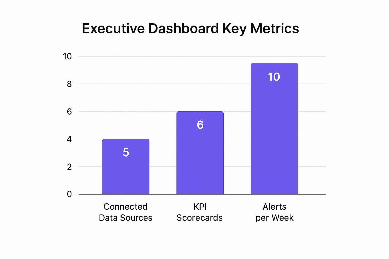
This bar chart highlights the interconnectedness of data sources, the focus on key performance indicators, and the proactive nature of automated alerts. Connecting multiple data sources (5 on average) allows for a holistic view of the business. Tracking numerous KPI scorecards (6 on average) enables comprehensive performance monitoring. A relatively high number of alerts per week (10 on average) suggests a system designed for proactive issue identification and resolution.
2. Power BI Financial Performance Dashboard
Power BI Financial Performance Dashboards offer a robust solution for organizations seeking comprehensive financial reporting, budget tracking, and profitability analysis. Leveraging the power of Microsoft’s ecosystem, these dashboards integrate seamlessly with familiar tools like Excel and SharePoint. This integration streamlines data import and report sharing, making it easier for finance teams to consolidate, analyze, and visualize key financial data. These dashboards provide interactive visualizations that empower users to explore financial data dynamically, uncovering insights that might otherwise be missed.

Examples of Effective Implementation
Several organizations have successfully implemented Power BI Financial Performance Dashboards to gain better control over their finances. Heathrow Airport utilizes Power BI for financial planning and operational cost analysis, optimizing resource allocation and improving efficiency. Adobe implemented Power BI dashboards for real-time revenue tracking and subscription analytics, enabling data-driven decisions related to pricing and marketing strategies. Milliken & Company leverages Power BI for financial consolidation across its global operations, simplifying complex reporting processes and improving financial transparency.
Actionable Tips for Implementation
- Leverage Existing Excel Models: Accelerate dashboard development by importing existing Excel financial models directly into Power BI.- Power BI Premium: Consider Power BI Premium for enhanced performance, advanced features, and larger data capacity.- Incremental Refresh: Optimize performance with large financial datasets by implementing incremental refresh, updating only the changed data.- Template Apps: Create template apps for standardized financial reporting, ensuring consistency across the organization.- Power Automate Integration: Automate data refresh workflows with Power Automate for timely and accurate reporting.
When and Why to Use This Approach
Power BI Financial Performance Dashboards are particularly valuable for organizations that need a centralized, interactive view of their financial data. They are ideal for tracking key financial metrics, comparing actual performance against budgets, and identifying trends and anomalies. This approach is especially beneficial for organizations already utilizing the Microsoft ecosystem, as it simplifies integration and collaboration.
Key Benefits and Justification
The inclusion of Power BI Financial Performance Dashboards is justified by their ability to empower organizations with data-driven financial insights. They provide a single source of truth for financial data, eliminating the need for manual report consolidation. The interactive nature of these dashboards promotes deeper exploration and analysis. This, in turn, leads to more informed decision-making, improved financial performance, and better business outcomes. Learn more about Power BI.
3. Salesforce CRM Analytics Dashboard
Salesforce CRM Analytics Dashboards (formerly known as Wave Analytics) are specialized business intelligence dashboards designed specifically for customer relationship management and sales performance tracking. They provide deep insights into sales pipelines, customer behavior, lead conversion rates, and sales team performance within the Salesforce ecosystem. This empowers sales teams and managers to make data-driven decisions, optimize sales strategies, and improve overall customer relationship management. These dashboards leverage existing Salesforce data, eliminating the need for complex data integration processes.

Examples of Effective Implementation
Several organizations leverage Salesforce CRM Analytics Dashboards to gain a competitive edge in customer relationship management. T-Mobile uses these dashboards to track customer acquisition and retention metrics, allowing them to identify successful strategies and areas for improvement. American Express leverages CRM Analytics for sales territory optimization, ensuring that sales representatives are focused on the most promising leads. Spotify uses Salesforce dashboards for B2B sales performance and lead management, improving efficiency and driving revenue growth.
Actionable Tips for Implementation
- Start with Templates: Leverage pre-built Wave templates to accelerate dashboard deployment and ensure a consistent look and feel.- Einstein Discovery: Use Einstein Discovery to identify key sales drivers and predictive insights.- Data Governance: Implement data governance policies to ensure clean and accurate CRM data for reliable analysis.- Role-Based Dashboards: Create role-based dashboards tailored to the specific needs of different sales team levels (e.g., representatives, managers, executives).- Mobile-First Design: Leverage mobile-first design principles for field sales representatives to access crucial data anytime, anywhere.
When and Why to Use This Approach
Salesforce CRM Analytics Dashboards are particularly valuable when deep insights into customer behavior and sales performance are needed. They are ideal for tracking progress towards sales targets, identifying bottlenecks in the sales pipeline, and optimizing sales strategies based on real-time data. This approach is especially beneficial for organizations already using the Salesforce platform, as it seamlessly integrates with existing CRM data.
Key Benefits and Justification
The inclusion of Salesforce CRM Analytics Dashboards in this list is warranted due to their focused approach to CRM analytics. They provide a centralized hub for all relevant customer and sales data, eliminating the need for disparate reporting systems. The interactive nature of these dashboards allows sales teams to explore data dynamically, uncovering hidden trends and opportunities. This leads to more informed sales strategies, improved customer relationships, and increased revenue generation. Learn more about Salesforce CRM Analytics.
4. Google Analytics Intelligence Dashboard
Google Analytics Intelligence Dashboards represent a powerful fusion of web analytics and machine learning. They provide businesses with actionable insights into website performance, user behavior, and marketing campaign effectiveness. By leveraging Google’s advanced algorithms, these dashboards offer automated insights and anomaly detection, streamlining digital marketing optimization. This empowers marketers to understand what’s working, what’s not, and where to focus their efforts.
Examples of Effective Implementation
Several organizations effectively utilize Google Analytics Intelligence Dashboards. The New York Times uses them to optimize content performance, understanding which articles resonate most with readers and adjusting their content strategy accordingly. Airbnb leverages GA Intelligence for user experience and conversion analysis, identifying pain points in the booking process and improving conversion rates. HubSpot uses these dashboards to track inbound marketing performance, analyzing which channels and campaigns drive the most qualified leads.
Actionable Tips for Implementation
- Set up Custom Goals and Events: Track business-specific metrics that align with your objectives.- Use Google Data Studio: Enhance visualization capabilities and create customized reports.- Implement Enhanced E-commerce Tracking: Gain detailed insights into product performance and customer purchasing behavior.- Create Custom Segments: Perform targeted analysis on specific user groups for a more granular understanding.- Leverage Intelligence Alerts: Enable proactive monitoring and receive notifications about significant changes or anomalies.
When and Why to Use This Approach
Google Analytics Intelligence Dashboards are essential for any business seeking to maximize its online presence. They are particularly valuable when dealing with large datasets and complex digital marketing campaigns. This approach is ideal for identifying trends, uncovering hidden opportunities, and making data-driven decisions to improve website performance, user engagement, and marketing ROI.
Key Benefits and Justification
The inclusion of Google Analytics Intelligence Dashboards in this list is crucial due to their ability to transform raw data into actionable insights. They provide a centralized hub for all website and marketing data, eliminating the need to navigate multiple platforms. The automated insights and anomaly detection features save time and resources, allowing marketers to focus on strategic initiatives. The ability to connect these dashboards with other Google marketing products creates a seamless ecosystem for digital marketing management. Learn more about Google Analytics.
This approach empowers businesses to understand their online audience, optimize their website, and improve marketing campaign effectiveness, ultimately leading to increased conversions and business growth.
5. QlikView Interactive Dashboard
QlikView Interactive Dashboards offer a distinct approach to business intelligence through their associative data model. This model allows users to explore data relationships dynamically. By clicking on a data point in one visualization, related information across all other visualizations on the dashboard automatically filters, revealing hidden connections and patterns. This interactive exploration empowers users to uncover insights that might be missed with traditional, hierarchical dashboards.
Examples of Effective Implementation
Several companies have leveraged QlikView’s interactive capabilities to gain valuable insights. Philips uses QlikView for global supply chain analytics and inventory optimization, enabling them to react to market changes and demand fluctuations more effectively. Raymond James implemented QlikView for financial services performance tracking, providing advisors with a comprehensive view of client portfolios and market trends. Subaru uses QlikView dashboards for manufacturing quality control and dealer performance, allowing for quick identification of potential issues and improved operational efficiency.
Actionable Tips for Implementation
- Design Star Schema Data Models: Optimize performance by structuring data in a star schema, with a central fact table surrounded by dimension tables.- Use Set Analysis: Leverage set analysis for complex calculations and filtering based on specific criteria.- Implement Section Access: Ensure data security by implementing section access, controlling which users can access specific data subsets.- Create Master Calendar: Facilitate time-based analysis with a master calendar, enabling easy filtering and comparisons across different periods.- Leverage Incremental Loading: Improve performance with large datasets by using incremental loading, only updating new or changed data.
When and Why to Use This Approach
QlikView Interactive Dashboards are particularly valuable when exploring complex datasets with multiple interconnected variables. The associative model allows users to uncover hidden relationships and gain a deeper understanding of the data. This approach is ideal for situations where users need to perform ad-hoc analysis and explore data from different perspectives. It’s especially beneficial for organizations seeking to empower business users with self-service data discovery capabilities.
Key Benefits and Justification
QlikView’s inclusion in this list is justified by its unique associative model and interactive approach to data exploration. The ability to dynamically filter and explore data relationships sets it apart from traditional BI dashboards. This allows users to uncover insights that might otherwise be missed. QlikView empowers users to ask and answer complex business questions through interactive data discovery. Learn more about QlikView.
6. Looker Business Intelligence Platform
Looker is a modern, web-based business intelligence and data analytics platform that leverages a unique modeling layer called LookML. This modeling language defines business logic and metrics in a central location, creating a single source of truth for data analysis. Looker empowers organizations to build consistent, governed dashboards and reports while also providing the flexibility for ad-hoc analysis and embedded analytics directly within other applications.
Examples of Effective Implementation
Several companies have successfully integrated Looker into their data strategies. Spotify, for instance, utilizes Looker for in-depth music streaming analytics, gaining valuable insights into listener behavior and artist performance. This data informs strategic decisions related to playlist curation, music recommendations, and artist development. Kickstarter leverages Looker to analyze project funding trends and provide creators with data-driven insights to optimize their campaigns. Warby Parker, a prominent eyewear retailer, employs Looker dashboards for real-time retail performance monitoring and efficient inventory management.
Actionable Tips for Implementation
- Invest in LookML Training: Adequate LookML training for your development team is crucial for maximizing the platform’s potential and building robust, scalable data models.- Leverage Explores: Looker’s “Explores” feature provides flexible data access patterns, enabling users to easily create custom queries and reports without writing complex SQL.- Implement Robust Workflows: Establishing proper testing and deployment workflows ensures data quality and minimizes errors in production dashboards.- Utilize Persistent Derived Tables: For complex calculations and aggregations, persistent derived tables can significantly improve query performance and reduce dashboard load times.- Create Reusable Templates: Develop reusable dashboard templates to maintain consistency in design and branding across the organization, simplifying dashboard creation and maintenance.
When and Why to Use This Approach
Looker is particularly valuable when a company needs a robust, scalable BI platform that can support both standardized reporting and ad-hoc analysis. It is ideal for organizations seeking a single source of truth for their data, enabling consistent metrics and reporting across different departments. This approach is especially beneficial for data-driven companies that require embedded analytics and self-service data exploration capabilities.
Key Benefits and Justification
Looker’s inclusion in this list is justified by its innovative approach to business intelligence. The LookML modeling layer provides a powerful framework for data governance and consistency. The platform’s flexibility empowers users to explore data independently while ensuring data accuracy and security. This results in more informed decision-making at all levels of the organization. Learn more about Looker.
7. IBM Cognos Analytics Dashboard Suite
IBM Cognos Analytics Dashboard Suite is an enterprise-grade business intelligence and performance management platform. It empowers large organizations to create comprehensive dashboards for diverse needs. Cognos offers advanced reporting, financial planning tools, and AI-enhanced analytics to tackle complex enterprise requirements. Its robust framework enables data integration, analysis, and visualization, driving data-driven decisions across the organization.
Examples of Effective Implementation
Several industry leaders utilize IBM Cognos to gain valuable insights. Vodafone, a global telecommunications giant, uses Cognos for performance reporting across its international operations. This provides a consolidated view of key metrics. Johnson & Johnson leverages Cognos for analytics in pharmaceutical research and development, accelerating innovation. The Royal Bank of Canada employs Cognos dashboards for comprehensive financial reporting and risk management, ensuring regulatory compliance and strategic financial planning. These examples demonstrate Cognos’s adaptability and scalability in diverse sectors.
Actionable Tips for Implementation
- Plan for Training: Invest in comprehensive training and change management to ensure user adoption and maximize the platform’s potential.- Robust Data Modeling: Leverage Framework Manager, Cognos’s powerful data modeling tool, to create a solid foundation for accurate and efficient reporting.- Security First: Implement appropriate security roles and permissions early in the deployment process to protect sensitive data.- Design Best Practices: Adhere to proven practices for report and dashboard design, ensuring clarity, consistency, and usability.- Cloud Deployment: Consider cloud deployment for reduced infrastructure costs and improved scalability.
When and Why to Use This Approach
IBM Cognos Analytics is particularly valuable for large organizations with complex data requirements. It is ideal when robust reporting, financial planning, and advanced analytics are needed. This approach excels in environments where data from multiple sources needs integration and analysis. It allows for the creation of sophisticated dashboards catering to various stakeholders.
Key Benefits and Justification
The inclusion of IBM Cognos Analytics in this list is justified by its proven ability to deliver enterprise-grade business intelligence. It provides a centralized platform for data analysis, reporting, and performance management. The advanced features empower organizations to extract deep insights from their data, facilitating strategic decision-making. This leads to improved operational efficiency, better financial planning, and a stronger competitive advantage. Learn more about IBM Cognos Analytics.
Business Intelligence Dashboards Comparison
DashboardImplementation Complexity 🔄Resource Requirements ⚡Expected Outcomes 📊Ideal Use Cases 💡Key Advantages ⭐Tableau Executive DashboardModerate to High (steep curve for advanced features)High (enterprise licensing, performance tuning needed)High-quality interactive visualizations with predictive analyticsExecutive-level insights in cross-industry contextsIntuitive drag-drop, real-time data, scalable, strong communityPower BI Financial Performance DashboardModerate (best with Microsoft ecosystem)Moderate (cost-effective licensing)Comprehensive financial reporting with AI insightsMicrosoft-centric organizations for financial trackingSeamless MS integration, Excel compatibility, cost-effectiveSalesforce CRM Analytics DashboardModerate to High (requires Salesforce expertise)High (costly advanced features)Deep CRM insights with predictive sales analyticsSales-driven organizations on Salesforce platformAI-powered sales insights, mobile-ready, strong CRM integrationGoogle Analytics Intelligence DashboardLow to Moderate (complex for advanced setup)Low (mostly free, cloud-based)Automated ML insights on web and marketing performanceDigital marketing and e-commerce teamsFree access, advanced ML, strong Google tool integrationQlikView Interactive DashboardHigh (steep developer learning curve)High (expensive licensing, complex governance)Fast, associative data exploration with large datasetsComplex data exploration needs in manufacturing and financeUnique associative analytics, excellent performance with big dataLooker Business Intelligence PlatformHigh (requires technical LookML expertise)Moderate to High (higher cost for embedded use)Governed, consistent BI with flexible embedded analyticsTech-savvy companies needing strong governance and embeddingStrong governance, developer-friendly, excellent embeddingIBM Cognos Analytics Dashboard SuiteVery High (complex setup and training)Very High (heavy infrastructure and resource demands)Comprehensive enterprise BI with advanced AI and financial planningLarge enterprises needing robust governance and securityEnterprise-grade security, AI-enhanced analytics, extensive customization
Elevate Your Business with Strategic BI Dashboards
The business intelligence dashboard examples we’ve explored, from Tableau’s executive overview to IBM Cognos’s comprehensive suite, demonstrate the transformative power of data visualization. Each example underscores the importance of tailoring dashboards to specific business needs and user roles. By understanding the strategic “why” behind each design choice, you can unlock the true potential of your own data.
Key Takeaways for Effective BI Dashboards
- User-Centric Design: Design with the end-user in mind. Consider their information needs, technical skills, and the decisions they need to make. The Salesforce CRM Analytics Dashboard exemplifies this by prioritizing key sales metrics for sales teams.- Actionable Insights: Dashboards should not just present data; they should drive action. The Power BI Financial Performance Dashboard demonstrates this by highlighting key performance indicators (KPIs) that directly inform financial decisions.- Data Storytelling: A compelling narrative makes data more engaging and understandable. The Google Analytics Intelligence Dashboard excels at this by transforming raw website traffic data into clear, insightful trends.- Interactive Exploration: Empower users to explore data on their own terms. QlikView’s interactive dashboards provide a robust example of how users can delve deeper into the data to uncover hidden insights.- Platform Selection: Choosing the right platform is crucial. Consider factors like data sources, integration capabilities, and the specific features offered by platforms like Looker and IBM Cognos.
Implementing Effective BI Dashboards: Next Steps
Start by identifying your key business objectives and the KPIs that truly matter. Then, select a BI platform that aligns with your technical capabilities and budget. Focus on designing user-centric dashboards that highlight actionable insights. Iterate and refine your dashboards based on user feedback and evolving business needs.
The Power of Strategic Data Visualization
Mastering the art of BI dashboard design is not just about pretty charts and graphs. It’s about empowering your organization to make data-driven decisions, optimize performance, and achieve strategic goals. From enhancing customer retention to streamlining operations, effective business intelligence dashboard examples provide a roadmap for success in today’s data-rich world. By leveraging the insights gleaned from these examples, you can unlock new levels of efficiency, innovation, and growth.
Ready to transform your data into actionable insights and supercharge your customer success strategies? Explore Statisfy, an AI-driven platform that seamlessly integrates with your existing systems to deliver powerful, personalized business intelligence dashboards. Statisfy allows you to deepen your customer understanding and optimize your customer journey like never before.