
Mastering Data Visualization Best Practices
By Navin Agrawal · Co-Founder & Head of AI, Statisfy
Data visualization isn’t just about making data pretty.It’s about turning complex information into clear, compelling stories that actually inspire people to act. This is the art of making data not just visible, but truly understandable by picking the right charts, using color with purpose, and cutting out all the distracting noise.
From Numbers to Narratives The Power of Visual Data

Welcome to the place where abstract numbers find their voice and become powerful, actionable stories. This is so much more than creating nice-looking graphs; it’s about transforming raw information into strategic tools that guide better decisions.
Think about it this way: raw data is like a giant pile of puzzle pieces. It’s confusing, a bit overwhelming, and doesn’t tell you much on its own. A great visualization is the finished puzzle—a clear picture that anyone, from the CEO to a frontline manager, can understand in a single glance.
That’s the real core of data visualization best practices: making data insightful. We’re building a bridge between complicated datasets and the way our brains are naturally wired to process visual information. It’s a well-known fact that our brains process images 60,000 times faster than plain text.
Why Visual Data Matters for Customer Success
For those of us in customer success, this is hardly a theoretical exercise. It’s a fundamental part of the job. You are sitting on a goldmine of data—product usage stats, support tickets, health scores, and customer feedback. Bringing that data to life visually turns it into critical business intelligence.
Instead of just showing a spreadsheet of user logins, a simple line chart can instantly flag a worrying drop in engagement for a key account. Rather than listing feature usage as a series of percentages, a bar chart can immediately show which tools customers love and which they’re ignoring, giving you a clear target for training. To see a great example of this in another field, check out this piece on the power of financial data visualization.
The goal of a visualization is not simply to be seen but to be understood. Its purpose is to provide the clearest path to insight, removing ambiguity and enabling confident action.
This guide is here to take you beyond the basics. We’re going to dig into the foundational principles that make the difference between a confusing graph and a compelling one.
- Clarity and Simplicity: We’ll cover how to declutter your visuals so the data itself can be the star of the show.- Strategic Chart Selection: You’ll learn how to choose the perfect chart type to tell your specific story effectively.- Purposeful Design: We’ll explore how to use elements like color and layout to intentionally guide your audience’s attention.
By getting a handle on these skills, you’ll completely change how you communicate with both your customers and your internal teams. You’ll be ready to turn complex user data into clear directives that boost customer retention, spot expansion opportunities, and ultimately prove the incredible value of your work. Let’s start building your visual storytelling toolkit.
Building a Foundation of Clarity

Before you ever think about what kind of chart to use or which colors to pick, we need to talk about the real foundation of great data visualization: clarity. It’s a simple concept, but it’s where most charts go wrong. The secret isn’t about adding flashy elements; it’s about knowing what to take away.
Think of your chart as a conversation. If you speak clearly and get to the point, people listen. But if you mumble, use confusing words, and go off on tangents, your message is lost. Every single pixel on that chart needs to have a purpose—to guide your customer or stakeholder straight to the insight.
This is more than just a preference; it’s one of the most crucial data visualization best practices. When you prioritize clarity, your work isn’t just seen—it’s understood, trusted, and acted upon.
Maximize Your Data-Ink Ratio
A game-changing concept here is the “data-ink ratio.” The idea is that most of the “ink” (or pixels) on your chart should be used to show the actual data, not for decoration. Every line, every label, every color needs to earn its spot.
So how do you do this? You have to become a ruthless editor of your own work. Look at every element on your chart and ask a simple question: “Does this help tell the story of the data?” If the answer is no, get rid of it.
This single practice can transform a messy, amateur-looking graph into a clean, professional visual that immediately communicates authority. It’s the difference between making your audience work for the insight and handing it to them on a silver platter.
“Perfection is achieved, not when there is nothing more to add, but when there is nothing left to take away.” — Antoine de Saint-Exupéry
This quote nails it. The most powerful visualizations are often the simplest.
Common Clutter to Eliminate
Your first mission is to hunt down and destroy the common culprits that create visual noise. Removing these non-essential parts will instantly make your charts easier to read and far more impactful.
Here’s what to look for and cut first:
- Heavy Gridlines: Faint gridlines can sometimes help, but thick, dark lines just put your data behind bars.- Unnecessary Borders: Your chart usually doesn’t need a box around it. The surrounding white space is a much cleaner, more natural frame.- 3D Effects and Shadows: These are classic chart junk. They distort how people see the data and make it nearly impossible to compare values accurately. Stick to a clean, flat 2D design.- Redundant Legends: If you can label your data directly (e.g., putting the category name right on the bar or line), you can often get rid of the legend completely. This saves your audience from having to look back and forth.
By cutting the fluff, you let the data be the hero of the story.
The Critical Role of Clear Labeling
Once you’ve cleared out the clutter, the next step is to make sure what’s left is crystal clear. Vague or missing labels are a recipe for disaster, forcing your audience to play a guessing game.
Your labels should be direct, concise, and leave no room for interpretation. This means:
- A Clear Title: The title must explain precisely what the chart is showing. Don’t just write “Monthly Numbers.” Instead, be specific: “Monthly Active Users for Tier 1 Accounts, Q3.”- Labeled Axes: Always label your X and Y axes, and don’t forget the units. Is that number on the y-axis dollars, percentages, or number of support tickets? Spell it out.- Direct Data Labels: When it makes sense, adding the exact value to a bar or a point on a line can add precision without creating more clutter.
This kind of methodical labeling eliminates any guesswork. If you work in a specialized field, you can find even more tailored advice by looking into the top financial data visualization techniques, which often pioneer new ways to present complex information clearly.
When you focus on a high data-ink ratio and sharp, precise labeling, you’re building a framework of honesty and clarity. This “clarity-first” mindset is the bedrock of everything else we’ll cover.
Choosing the Right Chart for Your Story
Once you’ve established a clear foundation, the next step is a big one: picking the right chart. This single choice can be the difference between a powerful insight and a confusing mess. Choosing the wrong visual is like trying to tell a scary story using a spreadsheet—the tool just doesn’t fit the narrative, and the entire point gets lost.
Think of each chart type as a specialist. A bar chart is great for making bold, direct comparisons. A line chart, on the other hand, is a patient storyteller, perfect for revealing the subtle trends that develop over time. Your job is to find the perfect match between the chart and the story your data is waiting to tell.
This isn’t about memorizing arbitrary rules. It’s about making your data’s story feel intuitive. For any Customer Success Manager, this means using a visual that answers a key business question almost instantly, guiding stakeholders to the right conclusion without them having to squint and struggle.
Matching Chart to Purpose
The first thing to do is define your goal. What, exactly, are you trying to prove or show? Are you comparing different categories? Illustrating a trend? Looking for a relationship between two things? Or are you just trying to show how different parts make up a whole? Each of these goals has a chart type that’s perfectly suited for the job.
Making the right choice has a real impact. Research has shown that when you align a graph with the nature of the data, people understand it far better. In fact, one 2019 study on chart effectiveness found that over 70% of misinterpretations in business meetings came from poorly chosen charts. That’s a huge margin of error you can easily avoid.
Let’s break down the most common chart types and what they do best.
Bar Charts for Comparison: When you need to compare separate, distinct categories, the bar chart is your go-to. It’s fantastic for showing “which is more” at a single glance. You could use one to compare feature adoption across different customer tiers, instantly showing which tools are hits and which ones need a promotional push.
Line Charts for Trends: To show how a metric changes over time, nothing beats a line chart. It’s the perfect choice for tracking things like customer health scores over a quarter, monitoring monthly active users, or visualizing the number of support tickets from week to week. That continuous line connects the dots, making it incredibly easy to spot trends, seasonal patterns, or sudden changes.
Scatter Plots for Relationships: Have a hunch that two different metrics might be connected? A scatter plot is the ideal tool for exploring that potential correlation. For example, you could plot customer satisfaction scores against the number of support tickets they’ve submitted to see if there’s a link between the two.
Heatmaps for Concentration: When you need to show the density of data across two different categories, a heatmap is a fantastic visual shortcut. You could use it to show which product features are most used at different times of the day, with darker colors representing higher activity.
A quick word of caution on pie charts: use them sparingly, if at all. They are only truly effective for showing parts of a whole when you have very few categories (ideally five or less) and the differences between the slices are obvious. In most cases, a simple bar chart actually communicates the same information more clearly.
Just as important as the chart type is the color you use. This decision tree is a great guide for selecting the right color palette based on your data, which is a critical part of making your chart effective.
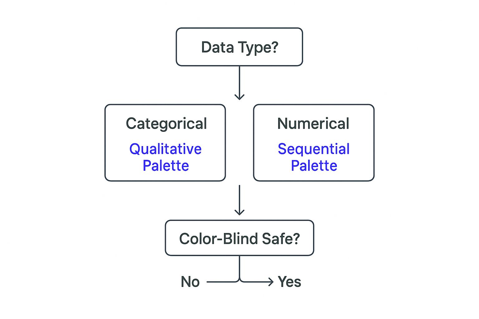
As the visual shows, you start with your data type—is it categorical or numerical?—and follow the path to the right color scheme, always ending with a crucial accessibility check.
Matching Your Goal to the Right Chart Type
To make this even easier, here’s a quick reference table. Think of it as a cheat sheet for picking the right chart based on the story you need your data to tell. Your GoalRecommended Chart TypeBest Use Case ExampleComparing values across distinct categories.Bar ChartShowing which subscription plans brought in the most revenue last quarter.Showing a trend or changes over time.Line ChartTracking monthly active users over the past year to show growth.Showing parts of a whole (use with caution).Pie Chart / Donut ChartDisplaying the percentage breakdown of customers by industry (with 5 or fewer industries).Exploring the relationship between two variables.Scatter PlotSeeing if there’s a correlation between customer tenure and their NPS score.Showing the density or concentration of data.HeatmapVisualizing which days and times your support team receives the most inquiries. Keep this handy, and you’ll find that choosing the right visual becomes second nature, ensuring your data always makes the intended impact.
Putting It Into Practice With Examples
Let’s look at how this plays out in a couple of real-world scenarios.
Scenario 1: You want to show leadership which customer subscription plans are generating the most expansion revenue.
- Wrong Chart: A line chart. This would incorrectly imply that the data represents a trend over time, which isn’t the point you’re trying to make.- Right Chart: A bar chart. Each bar would represent a subscription plan (e.g., Basic, Pro, Enterprise), and its height would show the total expansion revenue. The comparison would be instant and undeniable.
Scenario 2: You need to demonstrate how a new onboarding program has affected customer engagement over the last six months.
- Wrong Chart: A pie chart. This would only show a single snapshot in time, completely missing the “before and after” story.- Right Chart: A line chart. The horizontal axis would show the six-month timeline, while the vertical axis tracks a key engagement metric, like weekly active users. You could even add a vertical line to mark the exact date the new onboarding launched, making its impact crystal clear.
By deliberately choosing the right vehicle for your data, you guarantee your message is not only seen but truly understood and acted upon. This is one of the core pillars of creating effective data visualizations.
Using Color with Purpose and Accessibility

Color is easily one of the most powerful tools in your data viz toolkit. It grabs attention, highlights what matters, and tells your audience’s eyes exactly where to look. But without a thoughtful approach, that same color can create a mess, misleading or even completely excluding people.
The secret is to stop thinking of color as decoration and start using it with intention. Every single hue should have a job to do—whether it’s grouping related items, showing the intensity of a metric, or flagging a critical risk. This strategic mindset is a cornerstone of effective data visualization best practices and what separates a basic chart from a high-impact communication tool.
For anyone in customer success, this means using color to build intuitive customer health dashboards or to instantly show risk during a portfolio review. The right choice can be the difference between a stakeholder nodding along in agreement or just squinting at the screen in confusion.
Choosing the Right Palette for Your Data
Your data itself should be your guide when picking colors. Not all palettes work for all data types, and forcing the wrong one can completely distort the story you’re trying to tell.
Here’s a quick way to think about the main palette types:
- Sequential Palettes: These are your go-to for showing numerical data that moves from low to high. Think of a single color fading from light to dark (like light blue to a deep navy) to represent values like revenue growth, product usage, or survey scores.- Diverging Palettes: Use these when your data has a meaningful center point, like a target, a break-even point, or zero. A diverging palette uses two distinct colors that meet at a neutral middle, making it perfect for showing positive and negative values, like profit and loss or performance against a goal.- Qualitative (or Categorical) Palettes: When you’re visualizing distinct groups that don’t have a natural order—like different customer segments, product lines, or regions—you need a qualitative palette. The goal here is to use totally different, contrasting colors so each category stands out on its own.
When you match your palette to your data type, you create a visual language that your audience gets immediately, without even having to think about it.
Designing for Everyone with Accessible Colors
Great design is always inclusive. A fundamental rule in data visualization is making sure your work is accessible to everyone, including those with color vision deficiencies. It’s a huge mistake to rely only on color to communicate meaning, especially since about 8% of men and 0.5% of women worldwide have some form of color blindness. To dive deeper into this and other core principles, you can explore some excellent data visualization approaches that prioritize accessibility.
The most effective and ethical way to use color is to assume someone can’t see it at all. If your chart is still understandable without color, you’ve succeeded.
This forces you to reinforce your color choices with other visual cues. Color should never be the only thing carrying the weight of your message.
Here are a few ways to back up your colors:
- Use Patterns or Textures: Apply different patterns, like stripes or dots, to the slices of a pie chart or the bars in a bar chart.- Add Icons or Symbols: Place a unique icon next to each category in your legend or even directly on the chart itself.- Apply Direct Labels: This is often the clearest method of all. Labeling your data series directly on the chart can eliminate the need for a separate legend entirely.
Practical Tips for Accessible Color Use
Beyond just adding backup cues, you need to be deliberate about the specific colors you pick. Strong contrast and well-tested palettes are non-negotiable if you want everyone to be able to read your work.
- Check Your Contrast: Make sure there’s enough contrast between your text, your data visuals, and the background. Free tools like WebAIM’s Contrast Checker can instantly tell you if your color combinations pass accessibility standards.- Use Colorblind-Safe Palettes: Don’t try to reinvent the wheel. Many visualization tools and resources like ColorBrewer offer pre-made palettes specifically designed to be clear for people with common types of color vision deficiency.- Limit Your Colors: Don’t create a “rainbow effect” that overwhelms your audience. A focused, intentional palette of no more than six colors is usually plenty to keep your visualization clean and easy to follow.
By putting accessibility at the heart of your color strategy, you’re not just being inclusive—you’re ensuring your insights are understood by the widest possible audience, which reinforces the clarity and professionalism of everything you present.
How AI Is Shaping the Future of Visualization
The world of data visualization is moving at an incredible pace, and artificial intelligence is in the driver’s seat. AI is fundamentally changing how we approach data, shifting us away from the tedious, manual work of building charts and toward intelligent, automated storytelling. This lets professionals spend less time wrestling with data prep and more time on what actually moves the needle: strategy and interpretation.
Think of it this way: traditional visualization was like building a car from a kit. You had to source every part, assemble the engine, and weld the frame yourself just to get a working vehicle. AI is the modern assembly line; it takes your raw data—that pile of parts—and quickly turns it into a polished, effective, and road-ready visualization.
This automation isn’t just about picking the right chart. AI-powered tools can now clean up messy datasets, spot important patterns, and even suggest the most compelling story hiding in your data before you’ve even begun.
The Rise of Personalized Data Experiences
One of the biggest impacts of AI is the shift to dynamic, personalized data experiences. It used to be that everyone stared at the same static dashboard. Now, AI can customize what each person sees based on their role, their goals, and how they’ve interacted with the data in the past.
A CEO might see a high-level summary of customer health across the entire company, focused on big-picture metrics like retention and revenue. At the same exact time, a Customer Success Manager looking at the same core data gets a detailed view of their specific accounts, complete with risk alerts and flags for expansion opportunities.
AI-powered visualization isn’t just about making prettier charts. It’s about delivering the right insight to the right person at the right time, in a way they can immediately understand.
This kind of personalization makes the data far more relevant and engaging. By analyzing user behavior, AI can adapt visualizations to fit individual cognitive styles and preferences, a technique shown to boost user engagement by over 40%. For example, a sales leader gets a clean dashboard with just the key metrics, while a data analyst has the power to drill down into the nitty-gritty details.
Your AI Co-Pilot for Better Decisions
AI is also stepping into the role of an expert co-pilot, guiding you toward better visualization choices. So many data viz mistakes happen simply because someone picked a chart that just didn’t fit the story they were trying to tell. AI can act as your built-in expert, analyzing your dataset and suggesting the most effective visual format from the get-go.
- Preventing Common Errors: It can warn you when a pie chart is a poor choice for your data or recommend a line chart over a bar chart to show a trend over time.- Highlighting Key Insights: AI can automatically find and visually emphasize the most critical data points, like a sudden drop in product usage or a spike in positive customer sentiment.- Generating Natural Language Summaries: Many modern tools can even write a short, plain-English summary of what the chart shows, making complex information accessible to everyone, regardless of their technical skill.
This guidance effectively democratizes data analysis. It empowers people who aren’t data scientists to create visuals that are clear, accurate, and powerful, ensuring decisions are based on solid evidence. Understanding the latest advancements in data infrastructure and AI is key to seeing just how deeply these technologies will reshape the field. As AI becomes more tightly woven into our everyday tools, it will be an essential partner in turning raw data into decisive action.
Answering Your Top Data Visualization Questions
Even when you’ve got the basics down, some practical questions always come up when you start building your own charts. Let’s tackle a few of the most common ones I hear from customer success pros so you can feel confident in your design choices.
How Many Colors Should I Use in a Chart?
It can be tempting to throw a rainbow of colors at a chart, but less is almost always more. As a rule of thumb, stick to no more than six colors in a single visualization.
Once you go beyond that, you get a “rainbow effect” that’s just visual noise. It distracts your audience and makes the chart a chore to read. A tight, focused color palette keeps the message clean and directs attention where it matters. Your goal is clarity, not just making something colorful.
When in doubt, simplify. A single color in varying shades (what we call a sequential palette) is often far more effective for showing levels of intensity than a bunch of different competing hues.
For example, imagine you’re showing customer health scores. Using a single blue that goes from light to dark is an incredibly intuitive way to represent scores from low to high. Anyone can understand it in a split second.
How Do I Make My Visualizations Accessible?
Thinking about accessibility from the start isn’t just a nice-to-have; it’s fundamental to good design. The golden rule is to never rely on color alone to tell your story. A good chunk of the population has some form of color vision deficiency, so your charts have to make sense without it.
Here are a few practical ways to make your work accessible to everyone:
- Use Patterns and Shapes: Instead of just using different colors for categories, pair them with distinct patterns (like stripes or dots) or even unique icons.- Check for High Contrast: Make sure there’s a strong contrast between your text, the data points, and the background. There are plenty of free online tools you can use to check your color combinations.- Add Direct Labels: Whenever it makes sense, put labels right on the data series itself. This is often much clearer than forcing someone to look back and forth at a separate legend, and it’s a huge help for people using screen readers.
Can I Use 3D Charts?
My advice here is pretty straightforward: just say no to 3D charts. I know they can look slick at first glance, but they almost always distort the data. The 3D perspective and skewed angles make it incredibly difficult for our eyes to accurately compare the values.
Think about it—a simple 2D bar chart gives you an honest, at-a-glance comparison. The 3D version, with its tilted perspective, introduces ambiguity. You’re sacrificing data integrity for a bit of visual flair, and that’s never a good trade-off. Honesty and clarity should always win.
Now that we’ve covered some common hurdles, you might be wondering how to apply these principles efficiently. Let’s look at some frequently asked questions in a quick, easy-to-reference format.
Frequently Asked Questions
QuestionAnswer**What’s the #1 mistake to avoid in data visualization?**Making it too complicated. Overloading a chart with too much data, too many colors, or unnecessary design elements (like 3D effects) is the fastest way to confuse your audience. Clarity is king.**When should I use a pie chart?**Sparingly. Pie charts are only effective when you’re showing parts of a whole for a small number of categories (ideally 2-5). If you have more than that, a bar chart is almost always a clearer option.**How can I make my charts tell a better story?**Start with the “so what?” What is the single most important insight you want your audience to take away? Use titles, annotations, and color strategically to highlight that key message. Guide their eyes to the conclusion.**Do I need expensive software to create great visuals?**Not at all. While specialized tools offer more power, you can create incredibly effective and clear visualizations using everyday tools like Excel or Google Sheets. The principles of good design matter far more than the price of the software. Ultimately, practice is what builds confidence. By keeping these answers in mind, you’ll be well on your way to creating visuals that don’t just show data, but truly communicate insights.
Ready to turn your customer data into clear, actionable insights automatically? Statisfy uses AI to build dynamic visualizations and generate proactive recommendations, freeing you to focus on strategic customer relationships. Discover how our platform can help you improve retention and drive growth.