AI In CS
<h2>Why Your Business Is Drowning in Data (And How to Swim)</h2><p>It’s a familiar story: every customer interaction, click, and transaction adds to a growing ocean of information. Businesses today aren&#39;t just collecting data; they&#39;re submerged in it. The real challenge isn&#39;t gathering more—it&#39;s <strong>turning data into insights</strong> that actually mean something for your bottom line. Traditional reporting often gives you a rearview mirror perspective, telling you <em>what</em> happened last quarter. But to get ahead, you need a GPS that tells you where to turn next. This means finding the crucial signals hidden within the overwhelming noise.</p><p>The sheer volume of information being created is almost hard to comprehend. Consider this: the amount of data generated worldwide is projected to grow from around <strong>64 zettabytes in 2020 to over 394 zettabytes by 2028</strong>. This incredible explosion of information highlights the urgent need for smarter ways to analyze what we collect. You can dive deeper into these <a href="https://www.statista.com/statistics/871513/worldwide-data-created/">global data trends</a> to understand the scale of the challenge.</p><p>The chart below from <a href="https://www.statista.com/">Statista</a> visualizes this exponential growth, showing just how quickly our data universe is expanding.</p><p><img src="https://cdn.outrank.so/e1409c6b-c8fb-4679-a751-936bbf228698/5a8c82c6-0d75-4810-94ec-26eea1424b7c.jpg" alt="A graph from Statista showing the volume of data created worldwide from 2010 to 2028. The y-axis shows zettabytes, and the x-axis shows the years. The line graph shows a steep upward curve, starting at 2 zettabytes in 2010 and projected to reach 394 zettabytes by 2028."></p><p>What this trend makes clear is that manual analysis and outdated reporting tools simply cannot keep up. The goal is no longer just about managing data, but mastering it.</p><h3>The Misconception of &quot;More Is Better&quot;</h3><p>One of the biggest myths paralyzing businesses is the belief that more data automatically equals better decisions. In reality, without the right approach, more data often leads to more confusion, not more clarity. I’ve seen teams spend months building complex dashboards that track hundreds of metrics, only to realize no one knows what to do with the information. They have plenty of data points but zero actionable direction.</p><p>This is where the process of <strong>turning data into insights</strong> becomes a strategic imperative. It&#39;s not about having every possible piece of information; it&#39;s about identifying the <em>right</em> information that answers your most pressing business questions.</p><p>For example, a Customer Success Manager doesn’t need to see every single product click a user makes. What they <em>do</em> need to know is: which patterns of clicks signal that a customer is struggling? Or which usage trends predict an upcoming renewal risk? Effective analysis filters out the irrelevant to highlight what’s truly important, transforming a sea of raw numbers into a clear, actionable instruction. This is the fundamental shift from being data-rich and insight-poor to becoming truly data-driven.</p><h2>Building Your Data Foundation Without Breaking the Bank</h2><p>Turning data into insights starts with something far less glamorous than AI: building a solid data foundation. Without clean, organized, and accessible information, even the most powerful analytics tools are useless. Many businesses assume this requires a huge investment and a team of data scientists, but that&#39;s a common misconception. The key is to be strategic, focusing on what actually matters.</p><p>First, you need to consolidate your customer information. Data often lives in separate silos—your CRM, support desk, billing system, and product usage logs. Each one tells a part of the story, but the real magic happens when you bring them together. To get real value from your data, you must first <a href="https://www.flowgenius.ai/post/master-the-data-integration-process-for-better-insights">master the data integration process</a> to unify your data sources for clear intelligence. This isn’t about building a massive, costly data warehouse from day one. Instead, focus on connecting your most critical sources to create a unified view of your customers.</p><h3>From Collection to an Actionable Pipeline</h3><p>Effective data infrastructure is about creating a reliable flow from collection to analysis. The process starts by identifying your key data sources, understanding the volume you&#39;re dealing with, and establishing a clear pipeline for processing.</p><p>The visual below shows a simple yet powerful flow: pulling from various sources, handling a significant daily volume, and running it through a streamlined processing pipeline.</p><p><img src="https://cdn.outrank.so/e1409c6b-c8fb-4679-a751-936bbf228698/c53f9f14-9129-428e-89c8-ee538d94c63e.jpg" alt="Infographic about turning data into insights"></p><p>This process illustrates how a company can manage <strong>200 GB</strong> of data from <strong>five distinct sources</strong> daily with an efficient <strong>three-step processing pipeline</strong>. It shows that managing large-scale data is achievable without a massive team or budget.</p><h3>Ensuring Data Quality and Reliability</h3><p>Once your data is flowing, the next job is ensuring its quality. Bad data leads to bad insights, period. You can implement simple validation rules to spot issues before they contaminate your analysis. Think about it in practical terms:</p><ul><li><strong>Completeness:</strong> Are there missing values in critical fields like customer sign-up dates or subscription levels? Incomplete records can seriously skew your renewal forecasts.</li><li><strong>Consistency:</strong> Is the same customer identified with different IDs across your CRM and billing system? These inconsistencies make it impossible to track a customer&#39;s full journey and lifetime value.</li><li><strong>Accuracy:</strong> Does your usage data actually reflect customer activity, or are there bugs in the tracking? A single flaw here can lead to completely false conclusions about feature adoption or product health.</li></ul><p>To help you get a handle on this, here&#39;s a framework we use to assess and improve data quality. It breaks down what to look for and how to fix it.</p><h4>Data Quality Assessment Framework</h4><p>A comprehensive comparison of data quality dimensions and assessment criteria for building reliable data foundations.</p><div class="w-richtext"><div class="w-embed"><table style="width:100%; border-collapse: collapse; margin-bottom: 20px;"><thead><tr><th align="left">Quality Dimension</th><th align="left">Assessment Criteria</th><th align="left">Impact on Insights</th><th align="left">Remediation Approach</th></tr></thead><tbody><tr><td align="left"><strong>Completeness</strong></td><td align="left">Check for null or empty values in essential fields (e.g., email, subscription tier, sign-up date).</td><td align="left">Skewed analytics, inaccurate customer segmentation, and unreliable predictive models.</td><td align="left">Implement mandatory fields in data entry forms. Run scripts to identify and flag incomplete records for manual or automated enrichment.</td></tr><tr><td align="left"><strong>Accuracy</strong></td><td align="left">Compare data against a known source of truth. For instance, validate addresses or cross-reference usage metrics with server logs.</td><td align="left">Misleading conclusions about customer behavior and flawed business decisions. For example, targeting the wrong users for an upsell.</td><td align="left">Set up data validation rules at the point of entry. Periodically audit data subsets against trusted sources.</td></tr><tr><td align="left"><strong>Consistency</strong></td><td align="left">Ensure data is uniform across different systems (e.g., customer ID format, date conventions).</td><td align="left">Fragmented customer views, making it impossible to create a 360-degree profile. You can&#39;t track a customer from lead to renewal.</td><td align="left">Establish a master data management (MDM) strategy. Use a single source of truth for key entities like &quot;customer&quot; and &quot;product.&quot;</td></tr><tr><td align="left"><strong>Timeliness</strong></td><td align="left">Verify that data is available when needed. Is your support ticket data from yesterday or last month?</td><td align="left">Delayed or irrelevant insights. Proactive outreach becomes reactive because the data lags behind real-world events.</td><td align="left">Automate data pipelines with scheduled syncs. Monitor data latency and set up alerts for significant delays.</td></tr></tbody></table></div></div><p>This table shows that a few targeted checks can prevent major headaches down the line. Each dimension directly influences the reliability of the insights you generate.</p><p>By establishing basic data governance and validation from the start, you build a foundation you can trust. This practical approach ensures that when you&#39;re <strong>turning data into insights</strong>, you&#39;re working with reality, not guesswork—and you don&#39;t need a huge budget to do it right.</p><h2>Making AI and Machine Learning Actually Work for You</h2><p><img src="https://cdn.outrank.so/e1409c6b-c8fb-4679-a751-936bbf228698/e828a8a6-8144-4e6b-a6c6-fcd88b15baaf.jpg" alt="A person working on a laptop, surrounded by abstract data visualizations, representing the process of turning data into insights."></p><p>Let&#39;s be real about artificial intelligence. For many, AI sounds like something out of a sci-fi movie, but its practical use is much closer than you might imagine, especially when it comes to <strong>turning data into insights</strong>. The point isn’t to replace your team with robots; it&#39;s to give them superpowers by automating the tedious work of digging through your customer data to find meaningful patterns.</p><p>Think of AI as a tireless analyst that can sift through millions of data points—product usage, support tickets, survey feedback—to spot trends a human might easily overlook. This doesn&#39;t require a complete overhaul of your current tech. Instead, it&#39;s about identifying specific, high-impact areas where machine learning can deliver real results. For instance, rather than manually checking on accounts, an AI agent can predict which customers are likely to churn based on subtle shifts in their behavior, empowering your team to step in before it&#39;s too late.</p><h3>From Raw Data to Predictive Power</h3><p>The success of any AI model comes down to one thing: the quality of the data it&#39;s fed. Giving it messy or incomplete information is like asking someone to navigate a maze blindfolded—you just won&#39;t get reliable results. That&#39;s why building a solid data foundation is an absolute must before you even think about algorithms.</p><p>Once your data is clean and organized, you can start using algorithms to answer important business questions. The model you choose really depends on what you want to achieve:</p><ul><li><strong>Classification algorithms</strong> are great for sorting customers into groups, like &quot;potential advocate,&quot; &quot;at-risk,&quot; or &quot;upsell opportunity.&quot;</li><li><strong>Regression models</strong> shine when it comes to forecasting. You could use one to predict a customer&#39;s future lifetime value based on how they&#39;re using your product now.</li><li><strong>Clustering algorithms</strong> can reveal natural groupings in your customer base that you never knew existed, helping you find new personas for targeted outreach.</li></ul><p>To make AI practical, look into key <a href="https://www.get-invoice.com/integrations/openai">integrations with advanced AI platforms</a> that can connect directly with the tools you already use. This simplifies the whole setup process.</p><h3>Balancing Automation with Human Expertise</h3><p>The true magic of AI happens when it works alongside human intuition, not in place of it. Machine learning outputs should be seen as strong suggestions, not as orders from on high. A model might flag a customer as &quot;at-risk,&quot; but it’s the Customer Success Manager who holds the context of that relationship and can decide on the best way to respond. This blend of automated pattern detection and human judgment is a powerful strategy.</p><p>The global data analytics market is proof of this, with projections showing a massive jump from <strong>USD 65 billion in 2024 to about USD 403 billion by 2032</strong>. This growth is driven by companies that master this very balance. You can read more about <a href="https://www.fortunebusinessinsights.com/data-analytics-market-108882">the data analytics market forecast</a>. By staying focused on practical uses and clear objectives, you can make AI a core part of your analytics toolkit.</p><h2>Turning Customer Data Into Your Secret Weapon</h2><p>Your customer data is more than just a collection of past interactions; it&#39;s practically a crystal ball for predicting what your customers will do next. The real magic happens when you use this data to get ahead of problems, spot new opportunities, and build genuinely stronger relationships. Forward-thinking companies use analytics not just to see what happened, but to anticipate what’s coming—like identifying at-risk accounts long before they even think about leaving.</p><p>This isn’t about being invasive or over-analyzing every single click. It’s about recognizing meaningful patterns that tell a story. For instance, a small dip in a key feature&#39;s usage might not seem like a big deal on its own. Neither would a drop in support ticket submissions. But when you see them happen together, they could be signaling a customer who is quietly disengaging right before they churn. The goal is to connect these dots before it&#39;s too late.</p><h3>From Raw Data to a Unified Customer Profile</h3><p>To get a clear picture of what&#39;s really going on, you have to bring together information from all your customer touchpoints. Think of your CRM, helpdesk software like <a href="https://www.zendesk.com">Zendesk</a>, and product usage logs as individual puzzle pieces. Only when you snap them together does the full image of your customer emerge. This unified view is the foundation for truly understanding their behavior.</p><p>This dashboard from <a href="https://www.salesforce.com">Salesforce</a> shows exactly what a <strong>Customer 360</strong> view can look like, pulling diverse data points into a single, easy-to-understand profile.</p><p>What this demonstrates is the power of seeing everything in one place—from recent support tickets to their entire purchase history. This complete view allows your team to have smarter, more helpful conversations instead of just guessing what a customer needs.</p><h3>Building an Early Warning System</h3><p>Once you have that unified profile, you can create an &quot;early warning system&quot; for your customer success team. This system&#39;s job is to automatically flag behaviors that point to both risks and opportunities, so your team can act fast.</p><p>Think about setting up triggers like these:</p><ul><li><strong>Risk Signal:</strong> A customer&#39;s login frequency drops by <strong>50%</strong> over a two-week period. This is a clear sign they might be losing interest.</li><li><strong>Opportunity Signal:</strong> A team consistently uses a specific set of advanced features. This makes them a perfect candidate for an upgrade or a case study.</li><li><strong>Health Signal:</strong> A customer actively provides feedback right after you release a new feature. This shows they&#39;re engaged and invested in your product&#39;s evolution.</li></ul><p>To make your customer data a true secret weapon, you need to implement effective <a href="https://blog.screendesk.io/analyzing-customer-feedback/">strategies for analyzing customer feedback</a>. This feedback often gives you the &quot;why&quot; behind the numbers, offering direct insight into their experience. By setting up these automated alerts, your team can stop being reactive firefighters and become proactive partners. <strong>This is how you stop playing catch-up and start leading the conversation.</strong></p><h2>Creating Insights That Actually Drive Decisions</h2><p>Having sophisticated tools and clean data is a great start, but it&#39;s only half the journey. The real magic happens when you <strong>turn that data into insights</strong> that actually spark action and create a measurable impact on the business. I’ve seen too many analytics teams produce stunning dashboards that nobody uses. They become digital dust collectors because the findings aren&#39;t tied to a clear business decision. The goal isn&#39;t just to show information; it&#39;s to tell a compelling story that guides your team toward a specific, valuable outcome.</p><p>Effective communication is the cornerstone of this process. An insight that seems obvious to a data analyst might be totally unclear to a busy executive or a frontline Customer Success Manager. You have to be the translator. For instance, instead of saying, &quot;We saw a <strong>15%</strong> drop in feature X usage,&quot; frame it in a way that resonates with your audience. Try this: &quot;We’ve identified a potential <strong>$50,000</strong> churn risk this quarter linked to customers disengaging with a key feature. Here’s our plan to re-engage them.&quot; This approach connects the data directly to what they care about most: the bottom line.</p><h3>From Analysis to Actionable Recommendations</h3><p>To get from interesting findings to concrete results, you need a solid framework for prioritizing your efforts. Not every insight is created equal. Some might highlight a quick fix, while others could signal a major strategic opportunity. The trick is to evaluate each one based on its potential business impact versus the effort required to implement a solution.</p><p>This is the point where you shift from being a data reporter to a strategic partner for the business. To help with this, I find a simple matrix can work wonders for assessing and prioritizing your findings.</p><p>Before you dive into the table, think of it as your strategic compass. It helps you navigate the sea of data points and focus your team&#39;s energy where it will matter most. It’s all about balancing ambition with practicality to get things done.</p><h4>Insight Impact Assessment Matrix</h4><p>A framework for evaluating and prioritizing insights based on business impact potential and implementation feasibility.</p><div class="w-richtext"><div class="w-embed"><table style="width:100%; border-collapse: collapse; margin-bottom: 20px;"><thead><tr><th align="left">Insight Category</th><th align="left">Business Impact</th><th align="left">Implementation Effort</th><th align="left">Time to Value</th><th align="left">Success Metrics</th></tr></thead><tbody><tr><td align="left"><strong>Quick Wins</strong></td><td align="left">Medium</td><td align="left">Low</td><td align="left">Short (1-4 weeks)</td><td align="left">Improve a specific metric, like user activation rate.</td></tr><tr><td align="left"><strong>Strategic Bets</strong></td><td align="left">High</td><td align="left">High</td><td align="left">Long (3-6+ months)</td><td align="left">Increase overall customer retention or LTV.</td></tr><tr><td align="left"><strong>Operational Fixes</strong></td><td align="left">Low</td><td align="left">Low</td><td align="left">Short (1-2 weeks)</td><td align="left">Reduce manual work or fix a minor process bug.</td></tr><tr><td align="left"><strong>Big Projects</strong></td><td align="left">High</td><td align="left">High</td><td align="left">Long (6-12+ months)</td><td align="left">Launch a new product feature or enter a new market.</td></tr></tbody></table></div></div><p>By categorizing your insights this way, you can build a much clearer roadmap. My advice? Start with the <strong>Quick Wins</strong> to build momentum and prove the value of your work. This is crucial for getting buy-in from skeptical stakeholders for the bigger, more resource-heavy projects down the line. For example, fixing a confusing part of your onboarding flow (<strong>Operational Fix</strong>) is far simpler than building a new feature suite (<strong>Big Project</strong>), but both add value in their own right.</p><p>Ultimately, the art of <strong>turning data into insights</strong> that drive decisions is about creating a continuous feedback loop. You present an insight, recommend an action, measure the result, and then feed that new data back into your analysis. This iterative process is what moves your analytics from a one-off report into an engine for continuous improvement and growth.</p><h2>Scaling Your Analytics Without Losing Your Mind</h2><p><img src="https://cdn.outrank.so/e1409c6b-c8fb-4679-a751-936bbf228698/74182b48-cbd4-4cec-8442-226383a216c9.jpg" alt="A team of people collaborating around a computer screen with charts and graphs, representing successful scaling of analytics operations.">As your company grows, the pressure on your analytics operations intensifies. The methods that worked perfectly for a startup with a few customers will buckle when you&#39;re suddenly dealing with thousands. The real challenge is scaling your ability for <strong>turning data into insights</strong> without burning out your team or your budget. I’ve talked to many analytics leaders who’ve managed this kind of rapid growth, and they all say the same thing: scaling isn&#39;t about buying more expensive tools; it’s about changing your entire approach.</p><p>One of the most common mistakes is trying to handle everything at once. A small, dedicated team can quickly become overwhelmed by a constant flood of requests from every department. To avoid this, you need to build a structure that can grow with the business without creating bottlenecks. This involves shifting from a reactive model—where you simply answer questions as they come—to a proactive one where you empower others to find their own answers.</p><h3>Building Your Analytics Dream Team</h3><p>Your initial hires in analytics are absolutely critical. You don&#39;t always need someone with a PhD in data science right off the bat. Instead, look for individuals who have a strong mix of technical skills and business sense. These people are often called <strong>&quot;analytics translators.&quot;</strong> They are invaluable because they can understand a business problem, dive into the data to uncover a solution, and then clearly communicate their findings to people who aren&#39;t data experts.</p><p>As you expand your team, think about how to structure it to best support different parts of the business. A hybrid approach often works best:</p><ul><li><strong>Centralized Hub:</strong> This is your core team. They are responsible for the heavy lifting: data governance, maintaining the infrastructure, and developing complex analytical models. This group ensures that your data is clean, consistent, and reliable across the board.</li><li><strong>Embedded Analysts:</strong> These are team members who work directly within specific departments like marketing, sales, or customer success. By being embedded, they develop a deep understanding of their domain, provide highly relevant insights, and help build a data-forward culture from the ground up.</li></ul><p>This model gives you the best of both worlds. It maintains a high level of technical expertise in your central hub while ensuring the insights produced are directly applicable to the day-to-day challenges faced by different departments.</p><h3>Choosing Tech That Grows with You</h3><p>Your technology stack needs to be ready for an increasing amount of data and more complex questions. The main goal should be to adopt tools that offer flexibility and automation. When you&#39;re looking at platforms like our own at <strong>Statisfy</strong>, give priority to solutions that can connect to various data sources, automate the tedious process of data preparation, and provide an intuitive interface for business users. This self-service capability is essential for scaling without adding headcount at every turn.</p><p>The demand for solid analytics is only going up. The data analytics market is projected to grow at a <strong>28.7% CAGR</strong>, reaching an estimated <strong>$302 billion by 2030</strong>. This trend highlights just how important scalable systems are for staying competitive. You can <a href="https://www.grandviewresearch.com/industry-analysis/data-analytics-market-report">explore the full data analytics market report</a> to get a deeper look at the numbers. By investing in adaptable processes and hiring the right people, you can make sure that as your company scales, so does your ability to make smart, data-informed decisions.</p><h2>Your Roadmap to Data-Driven Success</h2><p>Putting everything together into a practical roadmap is the final, crucial step in <strong>turning data into insights</strong>. Your journey doesn’t have to be a massive, company-wide overhaul. Instead, think of it as a series of deliberate, high-impact phases designed to build momentum and show value quickly, no matter your company&#39;s current analytical maturity. The key is to avoid common pitfalls by focusing on practical steps that deliver tangible results.</p><h3>Phase 1: Assess and Identify Quick Wins (Weeks 1-4)</h3><p>Before you can build anything new, you need an honest assessment of where you stand. The first month is all about getting a lay of the land and finding some low-hanging fruit. This isn&#39;t about achieving perfection; it&#39;s about making a noticeable impact right away.</p><p>So, where do you begin?</p><ul><li><strong>Conduct a data audit:</strong> Start by mapping out where your most critical customer information lives. Is it scattered across your CRM, a support platform like <a href="https://www.zendesk.com">Zendesk</a>, and a separate billing system? Documenting these sources is your first concrete task.</li><li><strong>Identify a key pain point:</strong> Grab a coffee with your customer success team. Ask them: What&#39;s the one question you wish you could answer right now? Maybe it&#39;s, &quot;Which of our new customers are most likely to churn before their first renewal?&quot; This question becomes your north star.</li><li><strong>Launch a pilot project:</strong> Now, focus all your initial energy on answering that single question. This approach builds credibility and proves the value of your efforts with a <strong>quick, measurable win.</strong> You&#39;re not boiling the ocean, just making a really good cup of tea.</li></ul><h3>Phase 2: Plan and Implement (Weeks 5-12)</h3><p>With a successful pilot under your belt, you&#39;ve earned the right to think bigger. This phase is about formalizing your processes and picking the tools that will grow with you. It’s crucial to manage expectations here; let everyone know this is an iterative process, not a one-and-done project. Success can be measured by tracking things like a reduction in manual reporting time or a direct improvement in a core metric like customer retention.</p><p>Ready to start your journey from data to decisions? <strong><a href="https://www.statisfy.com">Statisfy</a></strong> provides the AI-driven tools to automate this roadmap, helping you uncover actionable insights and empower your customer success teams from day one.</p>

Master Turning Data into Insights for Business Growth

Master Turning Data into Insights for Business Growth

Why Your Business Is Drowning in Data (And How to Swim)

It’s a familiar story: every customer interaction, click, and transaction adds to a growing ocean of information. Businesses today aren't just collecting data; they're submerged in it. The real challenge isn't gathering more—it's turning data into insights that actually mean something for your bottom line. Traditional reporting often gives you a rearview mirror perspective, telling you what happened last quarter. But to get ahead, you need a GPS that tells you where to turn next. This means finding the crucial signals hidden within the overwhelming noise.

The sheer volume of information being created is almost hard to comprehend. Consider this: the amount of data generated worldwide is projected to grow from around 64 zettabytes in 2020 to over 394 zettabytes by 2028. This incredible explosion of information highlights the urgent need for smarter ways to analyze what we collect. You can dive deeper into these global data trends to understand the scale of the challenge.

The chart below from Statista visualizes this exponential growth, showing just how quickly our data universe is expanding.

A graph from Statista showing the volume of data created worldwide from 2010 to 2028. The y-axis shows zettabytes, and the x-axis shows the years. The line graph shows a steep upward curve, starting at 2 zettabytes in 2010 and projected to reach 394 zettabytes by 2028.

What this trend makes clear is that manual analysis and outdated reporting tools simply cannot keep up. The goal is no longer just about managing data, but mastering it.

The Misconception of "More Is Better"

One of the biggest myths paralyzing businesses is the belief that more data automatically equals better decisions. In reality, without the right approach, more data often leads to more confusion, not more clarity. I’ve seen teams spend months building complex dashboards that track hundreds of metrics, only to realize no one knows what to do with the information. They have plenty of data points but zero actionable direction.

This is where the process of turning data into insights becomes a strategic imperative. It's not about having every possible piece of information; it's about identifying the right information that answers your most pressing business questions.

For example, a Customer Success Manager doesn’t need to see every single product click a user makes. What they do need to know is: which patterns of clicks signal that a customer is struggling? Or which usage trends predict an upcoming renewal risk? Effective analysis filters out the irrelevant to highlight what’s truly important, transforming a sea of raw numbers into a clear, actionable instruction. This is the fundamental shift from being data-rich and insight-poor to becoming truly data-driven.

Building Your Data Foundation Without Breaking the Bank

Turning data into insights starts with something far less glamorous than AI: building a solid data foundation. Without clean, organized, and accessible information, even the most powerful analytics tools are useless. Many businesses assume this requires a huge investment and a team of data scientists, but that's a common misconception. The key is to be strategic, focusing on what actually matters.

First, you need to consolidate your customer information. Data often lives in separate silos—your CRM, support desk, billing system, and product usage logs. Each one tells a part of the story, but the real magic happens when you bring them together. To get real value from your data, you must first master the data integration process to unify your data sources for clear intelligence. This isn’t about building a massive, costly data warehouse from day one. Instead, focus on connecting your most critical sources to create a unified view of your customers.

From Collection to an Actionable Pipeline

Effective data infrastructure is about creating a reliable flow from collection to analysis. The process starts by identifying your key data sources, understanding the volume you're dealing with, and establishing a clear pipeline for processing.

The visual below shows a simple yet powerful flow: pulling from various sources, handling a significant daily volume, and running it through a streamlined processing pipeline.

Infographic about turning data into insights

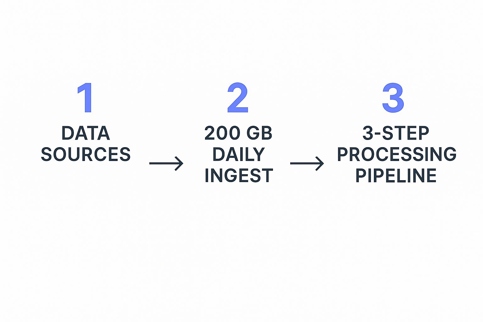
This process illustrates how a company can manage 200 GB of data from five distinct sources daily with an efficient three-step processing pipeline. It shows that managing large-scale data is achievable without a massive team or budget.

Ensuring Data Quality and Reliability

Once your data is flowing, the next job is ensuring its quality. Bad data leads to bad insights, period. You can implement simple validation rules to spot issues before they contaminate your analysis. Think about it in practical terms:

  • Completeness: Are there missing values in critical fields like customer sign-up dates or subscription levels? Incomplete records can seriously skew your renewal forecasts.
  • Consistency: Is the same customer identified with different IDs across your CRM and billing system? These inconsistencies make it impossible to track a customer's full journey and lifetime value.
  • Accuracy: Does your usage data actually reflect customer activity, or are there bugs in the tracking? A single flaw here can lead to completely false conclusions about feature adoption or product health.

To help you get a handle on this, here's a framework we use to assess and improve data quality. It breaks down what to look for and how to fix it.

Data Quality Assessment Framework

A comprehensive comparison of data quality dimensions and assessment criteria for building reliable data foundations.

Quality DimensionAssessment CriteriaImpact on InsightsRemediation Approach
CompletenessCheck for null or empty values in essential fields (e.g., email, subscription tier, sign-up date).Skewed analytics, inaccurate customer segmentation, and unreliable predictive models.Implement mandatory fields in data entry forms. Run scripts to identify and flag incomplete records for manual or automated enrichment.
AccuracyCompare data against a known source of truth. For instance, validate addresses or cross-reference usage metrics with server logs.Misleading conclusions about customer behavior and flawed business decisions. For example, targeting the wrong users for an upsell.Set up data validation rules at the point of entry. Periodically audit data subsets against trusted sources.
ConsistencyEnsure data is uniform across different systems (e.g., customer ID format, date conventions).Fragmented customer views, making it impossible to create a 360-degree profile. You can't track a customer from lead to renewal.Establish a master data management (MDM) strategy. Use a single source of truth for key entities like "customer" and "product."
TimelinessVerify that data is available when needed. Is your support ticket data from yesterday or last month?Delayed or irrelevant insights. Proactive outreach becomes reactive because the data lags behind real-world events.Automate data pipelines with scheduled syncs. Monitor data latency and set up alerts for significant delays.

This table shows that a few targeted checks can prevent major headaches down the line. Each dimension directly influences the reliability of the insights you generate.

By establishing basic data governance and validation from the start, you build a foundation you can trust. This practical approach ensures that when you're turning data into insights, you're working with reality, not guesswork—and you don't need a huge budget to do it right.

Making AI and Machine Learning Actually Work for You

A person working on a laptop, surrounded by abstract data visualizations, representing the process of turning data into insights.

Let's be real about artificial intelligence. For many, AI sounds like something out of a sci-fi movie, but its practical use is much closer than you might imagine, especially when it comes to turning data into insights. The point isn’t to replace your team with robots; it's to give them superpowers by automating the tedious work of digging through your customer data to find meaningful patterns.

Think of AI as a tireless analyst that can sift through millions of data points—product usage, support tickets, survey feedback—to spot trends a human might easily overlook. This doesn't require a complete overhaul of your current tech. Instead, it's about identifying specific, high-impact areas where machine learning can deliver real results. For instance, rather than manually checking on accounts, an AI agent can predict which customers are likely to churn based on subtle shifts in their behavior, empowering your team to step in before it's too late.

From Raw Data to Predictive Power

The success of any AI model comes down to one thing: the quality of the data it's fed. Giving it messy or incomplete information is like asking someone to navigate a maze blindfolded—you just won't get reliable results. That's why building a solid data foundation is an absolute must before you even think about algorithms.

Once your data is clean and organized, you can start using algorithms to answer important business questions. The model you choose really depends on what you want to achieve:

  • Classification algorithms are great for sorting customers into groups, like "potential advocate," "at-risk," or "upsell opportunity."
  • Regression models shine when it comes to forecasting. You could use one to predict a customer's future lifetime value based on how they're using your product now.
  • Clustering algorithms can reveal natural groupings in your customer base that you never knew existed, helping you find new personas for targeted outreach.

To make AI practical, look into key integrations with advanced AI platforms that can connect directly with the tools you already use. This simplifies the whole setup process.

Balancing Automation with Human Expertise

The true magic of AI happens when it works alongside human intuition, not in place of it. Machine learning outputs should be seen as strong suggestions, not as orders from on high. A model might flag a customer as "at-risk," but it’s the Customer Success Manager who holds the context of that relationship and can decide on the best way to respond. This blend of automated pattern detection and human judgment is a powerful strategy.

The global data analytics market is proof of this, with projections showing a massive jump from USD 65 billion in 2024 to about USD 403 billion by 2032. This growth is driven by companies that master this very balance. You can read more about the data analytics market forecast. By staying focused on practical uses and clear objectives, you can make AI a core part of your analytics toolkit.

Turning Customer Data Into Your Secret Weapon

Your customer data is more than just a collection of past interactions; it's practically a crystal ball for predicting what your customers will do next. The real magic happens when you use this data to get ahead of problems, spot new opportunities, and build genuinely stronger relationships. Forward-thinking companies use analytics not just to see what happened, but to anticipate what’s coming—like identifying at-risk accounts long before they even think about leaving.

This isn’t about being invasive or over-analyzing every single click. It’s about recognizing meaningful patterns that tell a story. For instance, a small dip in a key feature's usage might not seem like a big deal on its own. Neither would a drop in support ticket submissions. But when you see them happen together, they could be signaling a customer who is quietly disengaging right before they churn. The goal is to connect these dots before it's too late.

From Raw Data to a Unified Customer Profile

To get a clear picture of what's really going on, you have to bring together information from all your customer touchpoints. Think of your CRM, helpdesk software like Zendesk, and product usage logs as individual puzzle pieces. Only when you snap them together does the full image of your customer emerge. This unified view is the foundation for truly understanding their behavior.

This dashboard from Salesforce shows exactly what a Customer 360 view can look like, pulling diverse data points into a single, easy-to-understand profile.

What this demonstrates is the power of seeing everything in one place—from recent support tickets to their entire purchase history. This complete view allows your team to have smarter, more helpful conversations instead of just guessing what a customer needs.

Building an Early Warning System

Once you have that unified profile, you can create an "early warning system" for your customer success team. This system's job is to automatically flag behaviors that point to both risks and opportunities, so your team can act fast.

Think about setting up triggers like these:

  • Risk Signal: A customer's login frequency drops by 50% over a two-week period. This is a clear sign they might be losing interest.
  • Opportunity Signal: A team consistently uses a specific set of advanced features. This makes them a perfect candidate for an upgrade or a case study.
  • Health Signal: A customer actively provides feedback right after you release a new feature. This shows they're engaged and invested in your product's evolution.

To make your customer data a true secret weapon, you need to implement effective strategies for analyzing customer feedback. This feedback often gives you the "why" behind the numbers, offering direct insight into their experience. By setting up these automated alerts, your team can stop being reactive firefighters and become proactive partners. This is how you stop playing catch-up and start leading the conversation.

Creating Insights That Actually Drive Decisions

Having sophisticated tools and clean data is a great start, but it's only half the journey. The real magic happens when you turn that data into insights that actually spark action and create a measurable impact on the business. I’ve seen too many analytics teams produce stunning dashboards that nobody uses. They become digital dust collectors because the findings aren't tied to a clear business decision. The goal isn't just to show information; it's to tell a compelling story that guides your team toward a specific, valuable outcome.

Effective communication is the cornerstone of this process. An insight that seems obvious to a data analyst might be totally unclear to a busy executive or a frontline Customer Success Manager. You have to be the translator. For instance, instead of saying, "We saw a 15% drop in feature X usage," frame it in a way that resonates with your audience. Try this: "We’ve identified a potential $50,000 churn risk this quarter linked to customers disengaging with a key feature. Here’s our plan to re-engage them." This approach connects the data directly to what they care about most: the bottom line.

From Analysis to Actionable Recommendations

To get from interesting findings to concrete results, you need a solid framework for prioritizing your efforts. Not every insight is created equal. Some might highlight a quick fix, while others could signal a major strategic opportunity. The trick is to evaluate each one based on its potential business impact versus the effort required to implement a solution.

This is the point where you shift from being a data reporter to a strategic partner for the business. To help with this, I find a simple matrix can work wonders for assessing and prioritizing your findings.

Before you dive into the table, think of it as your strategic compass. It helps you navigate the sea of data points and focus your team's energy where it will matter most. It’s all about balancing ambition with practicality to get things done.

Insight Impact Assessment Matrix

A framework for evaluating and prioritizing insights based on business impact potential and implementation feasibility.

Insight CategoryBusiness ImpactImplementation EffortTime to ValueSuccess Metrics
Quick WinsMediumLowShort (1-4 weeks)Improve a specific metric, like user activation rate.
Strategic BetsHighHighLong (3-6+ months)Increase overall customer retention or LTV.
Operational FixesLowLowShort (1-2 weeks)Reduce manual work or fix a minor process bug.
Big ProjectsHighHighLong (6-12+ months)Launch a new product feature or enter a new market.

By categorizing your insights this way, you can build a much clearer roadmap. My advice? Start with the Quick Wins to build momentum and prove the value of your work. This is crucial for getting buy-in from skeptical stakeholders for the bigger, more resource-heavy projects down the line. For example, fixing a confusing part of your onboarding flow (Operational Fix) is far simpler than building a new feature suite (Big Project), but both add value in their own right.

Ultimately, the art of turning data into insights that drive decisions is about creating a continuous feedback loop. You present an insight, recommend an action, measure the result, and then feed that new data back into your analysis. This iterative process is what moves your analytics from a one-off report into an engine for continuous improvement and growth.

Scaling Your Analytics Without Losing Your Mind

A team of people collaborating around a computer screen with charts and graphs, representing successful scaling of analytics operations.As your company grows, the pressure on your analytics operations intensifies. The methods that worked perfectly for a startup with a few customers will buckle when you're suddenly dealing with thousands. The real challenge is scaling your ability for turning data into insights without burning out your team or your budget. I’ve talked to many analytics leaders who’ve managed this kind of rapid growth, and they all say the same thing: scaling isn't about buying more expensive tools; it’s about changing your entire approach.

One of the most common mistakes is trying to handle everything at once. A small, dedicated team can quickly become overwhelmed by a constant flood of requests from every department. To avoid this, you need to build a structure that can grow with the business without creating bottlenecks. This involves shifting from a reactive model—where you simply answer questions as they come—to a proactive one where you empower others to find their own answers.

Building Your Analytics Dream Team

Your initial hires in analytics are absolutely critical. You don't always need someone with a PhD in data science right off the bat. Instead, look for individuals who have a strong mix of technical skills and business sense. These people are often called "analytics translators." They are invaluable because they can understand a business problem, dive into the data to uncover a solution, and then clearly communicate their findings to people who aren't data experts.

As you expand your team, think about how to structure it to best support different parts of the business. A hybrid approach often works best:

  • Centralized Hub: This is your core team. They are responsible for the heavy lifting: data governance, maintaining the infrastructure, and developing complex analytical models. This group ensures that your data is clean, consistent, and reliable across the board.
  • Embedded Analysts: These are team members who work directly within specific departments like marketing, sales, or customer success. By being embedded, they develop a deep understanding of their domain, provide highly relevant insights, and help build a data-forward culture from the ground up.

This model gives you the best of both worlds. It maintains a high level of technical expertise in your central hub while ensuring the insights produced are directly applicable to the day-to-day challenges faced by different departments.

Choosing Tech That Grows with You

Your technology stack needs to be ready for an increasing amount of data and more complex questions. The main goal should be to adopt tools that offer flexibility and automation. When you're looking at platforms like our own at Statisfy, give priority to solutions that can connect to various data sources, automate the tedious process of data preparation, and provide an intuitive interface for business users. This self-service capability is essential for scaling without adding headcount at every turn.

The demand for solid analytics is only going up. The data analytics market is projected to grow at a 28.7% CAGR, reaching an estimated $302 billion by 2030. This trend highlights just how important scalable systems are for staying competitive. You can explore the full data analytics market report to get a deeper look at the numbers. By investing in adaptable processes and hiring the right people, you can make sure that as your company scales, so does your ability to make smart, data-informed decisions.

Your Roadmap to Data-Driven Success

Putting everything together into a practical roadmap is the final, crucial step in turning data into insights. Your journey doesn’t have to be a massive, company-wide overhaul. Instead, think of it as a series of deliberate, high-impact phases designed to build momentum and show value quickly, no matter your company's current analytical maturity. The key is to avoid common pitfalls by focusing on practical steps that deliver tangible results.

Phase 1: Assess and Identify Quick Wins (Weeks 1-4)

Before you can build anything new, you need an honest assessment of where you stand. The first month is all about getting a lay of the land and finding some low-hanging fruit. This isn't about achieving perfection; it's about making a noticeable impact right away.

So, where do you begin?

  • Conduct a data audit: Start by mapping out where your most critical customer information lives. Is it scattered across your CRM, a support platform like Zendesk, and a separate billing system? Documenting these sources is your first concrete task.
  • Identify a key pain point: Grab a coffee with your customer success team. Ask them: What's the one question you wish you could answer right now? Maybe it's, "Which of our new customers are most likely to churn before their first renewal?" This question becomes your north star.
  • Launch a pilot project: Now, focus all your initial energy on answering that single question. This approach builds credibility and proves the value of your efforts with a quick, measurable win. You're not boiling the ocean, just making a really good cup of tea.

Phase 2: Plan and Implement (Weeks 5-12)

With a successful pilot under your belt, you've earned the right to think bigger. This phase is about formalizing your processes and picking the tools that will grow with you. It’s crucial to manage expectations here; let everyone know this is an iterative process, not a one-and-done project. Success can be measured by tracking things like a reduction in manual reporting time or a direct improvement in a core metric like customer retention.

Ready to start your journey from data to decisions? Statisfy provides the AI-driven tools to automate this roadmap, helping you uncover actionable insights and empower your customer success teams from day one.

You might also like...

Here are some other posts from us you may enjoy reading
AI In CS
<p>Let&#39;s be honest, manual data entry is a silent killer of productivity. It’s the kind of tedious, repetitive work that eats up hours, drains employee morale, and, worst of all, opens the door to costly mistakes that can quietly sabotage your business. The good news is that we can replace this grind with smart automation that captures, checks, and enters information for you. This isn&#39;t just a minor tweak; it&#39;s a fundamental shift in how you operate, bringing massive gains in speed, accuracy, and overall efficiency.</p><h2>Why Automating Data Entry Is a Game Changer</h2><p><img src="https://cdn.outrank.so/e1409c6b-c8fb-4679-a751-936bbf228698/1ef41038-cc41-44da-9832-aebec23771d4.jpg" alt="A professional analyzing data on a computer screen, symbolizing the efficiency of automated data entry."></p><p>Forget the buzzwords for a second and think about the real-world cost of sticking with the old way. Manually keying in data isn&#39;t just inefficient; it&#39;s a genuine business risk. It ties up your best people with mind-numbing tasks, invites errors, and simply can&#39;t match the pace modern business demands.</p><p>Think about it. Your team might be spending a huge chunk of their week just punching in invoice numbers, updating customer info in the CRM, or processing sales orders one by one. This isn&#39;t just boring; it&#39;s a direct hit to your bottom line. Automating your data entry workflow flips that entire situation on its head.</p><h3>The Power of Precision and Speed</h3><p>The first thing you&#39;ll notice is a huge jump in data accuracy. People make mistakes—it&#39;s only natural. But in business, those little typos can have big consequences. Automated systems, on the other hand, can achieve accuracy rates between <strong>99.959% and 99.99%</strong>. That’s a world away from the typical human accuracy of <strong>96% to 99%</strong>. To put that in perspective, for every <strong>10,000</strong> records, automation might make just one or two mistakes, while a human could easily make hundreds. I&#39;ve seen firsthand how automation can slash the manual workload by around <strong>80%</strong>, and the impact is immediate.</p><p>This kind of precision sends positive ripples through your entire company.</p><ul><li><strong>Reliable Reporting:</strong> When your data is clean from the start, you get financial reports and business intelligence you can actually trust.</li><li><strong>Smarter Decisions:</strong> Confidence in your numbers means you can make bold, strategic moves without second-guessing your data.</li><li><strong>Happier Customers:</strong> Accurate orders and billing mean fewer frustrating problems that can damage customer loyalty.</li></ul><blockquote><p>By eliminating the need for manual data entry, firms can allocate more time to engaging with their network, meeting prospective investments, and driving deals.</p></blockquote><h3>Unlocking Your Team&#39;s True Value</h3><p>At the end of the day, this isn&#39;t just about entering data faster. It&#39;s about freeing your people to do more valuable work. When software is handling the grunt work, your team can pivot from tedious transcription to creative problem-solving, deep analysis, and building relationships with customers.</p><p>This is especially true for complex tasks like <a href="https://ai-for-excel.com/blog/automate-financial-reporting">automating financial reporting</a>, where accuracy and efficiency are paramount. You’re essentially turning a cost center into a strategic engine, letting your people focus on the human skills—thinking, creating, and connecting—that no software can replicate. That&#39;s the real power of automation.</p><h2>Building Your Data Entry Automation Plan</h2><p><img src="https://cdn.outrank.so/e1409c6b-c8fb-4679-a751-936bbf228698/f75ab270-1348-453d-a74e-ef577a246168.jpg" alt="A person using sticky notes on a glass wall to map out a workflow, representing the planning phase of automation."></p><p>Jumping into <strong>automating data entry</strong> without a solid strategy is a recipe for wasted time and money. It&#39;s like trying to build a house without a blueprint—you might end up with something, but it probably won’t be what you wanted. A good plan isn&#39;t about just buying software; it&#39;s about solving real business problems and making sure your efforts pay off.</p><p>The only way to start is by taking a hard look at your current data processes. Forget what you <em>think</em> is happening and go talk to the people on the ground. Sit with your finance team to see how invoices are actually processed, or shadow a sales rep to understand their lead management workflow. Your goal is to find those mind-numbing, repetitive tasks that eat up your team&#39;s day.</p><h3>Pinpoint the Automation Hotspots</h3><p>Think about where the manual grind is the worst. It&#39;s no surprise that nearly <strong>60%</strong> of workers feel they could get back six or more hours every week if the repetitive parts of their jobs were automated. Finding these opportunities is the key to getting a real return on your investment.</p><p>You&#39;re hunting for processes with these tell-tale signs:</p><ul><li><strong>High Volume:</strong> Tasks done over and over, all day long. Think entering purchase orders or processing expense reports.</li><li><strong>Standardized Inputs:</strong> Workflows that handle the same type of document repeatedly, like W-9 forms or standard utility bills.</li><li><strong>Prone to Human Error:</strong> Any process where a simple typo can create a cascade of problems down the line.</li><li><strong>Clear Rules:</strong> The task follows a predictable, &quot;if this, then that&quot; logic.</li></ul><p>A classic example is new customer onboarding. It usually involves pulling details from a sales form, creating a new entry in your CRM, generating a billing profile, and firing off a welcome email. It&#39;s a multi-step, rule-based process that’s practically begging to be automated.</p><blockquote><p>By eliminating the need for manual data entry, firms can allocate more time to engaging with their network, meeting prospective investments, and driving deals.</p></blockquote><p>Once you have a list of potential candidates, map out the current workflow for each one. I mean <em>really</em> map it out, from the second a document lands on someone&#39;s desk to the final destination for its data. This visual breakdown will throw the bottlenecks and inefficiencies into sharp relief, showing you exactly what needs to be fixed.</p><h3>Set Clear and Measurable Goals</h3><p>With your target processes in sight, you need to define what success actually looks like. A fuzzy goal like &quot;improve efficiency&quot; won&#39;t cut it. To understand the true impact of your automation plan, you need specific objectives you can measure.</p><p>Tie your goals directly to real-world key performance indicators (KPIs). For instance, aim to:</p><ul><li>Slash invoice processing time from <strong>3 days to just 4 hours</strong>.</li><li>Cut data entry errors in new customer accounts by <strong>95%</strong> within the first quarter.</li><li>Give the customer support team <strong>20 hours back</strong> each week by automating help desk ticket creation from emails.</li></ul><p>Having these kinds of clear targets does more than just help you build a business case. They give you a benchmark to measure against as you refine the process over time. This turns <strong>automating data entry</strong> from a simple tech project into a strategic move that delivers a clear, undeniable return on investment.</p><h2>Choosing Your Automation Toolkit</h2><p>The sheer number of automation tools on the market can feel overwhelming, but finding the right fit is simpler than you think. Now that you’ve pinpointed the exact processes you want to improve, it&#39;s time to select the software that will actually do the work. The trick is to understand the main categories of tools and what they&#39;re genuinely good at.</p><p>At a high level, the technology for <strong>automating data entry</strong> ranges from simple tools that just scan paper documents to sophisticated systems that can act like a human user across multiple apps. Getting a handle on these differences is the key to investing wisely.</p><h3>Core Automation Technologies</h3><p>When you strip it all down, two key technologies are the engine behind most data entry automation solutions:</p><ul><li><strong>Optical Character Recognition (OCR):</strong> Think of this as your digital translator. OCR software takes a look at a paper document or an image file (like a PDF from a scanner) and pulls the text out, turning it into data your computer can actually use. This is the bedrock technology for getting information off of invoices, receipts, and old paper forms and into your digital workflow.</li><li><strong>Robotic Process Automation (RPA):</strong> I like to think of RPA as a team of digital employees. You can program these software &quot;bots&quot; to handle repetitive, rules-based work by interacting with software just like a person would—clicking buttons, copying data from one field and pasting it into another, and logging in and out of different systems. RPA is a lifesaver for tying together older, clunky systems that don&#39;t have modern APIs to connect them.</li></ul><p>While these technologies are powerful on their own, many modern platforms—like Statisfy—combine them with a layer of AI and machine learning. This creates a much smarter, integrated solution that doesn’t just pull data, but can also understand its context, check it for mistakes, and send it where it needs to go. For anyone looking to get started without a team of developers, exploring <a href="https://www.spurnow.com/blogs/no-code-automation-tools">no-code automation tools</a> is a fantastic first step.</p><p>This infographic really puts the return on investment into perspective, showing the typical gains businesses see in time, money, and accuracy.</p><p>As you can see, the benefits aren&#39;t just about moving faster. We&#39;re talking about real financial savings and a massive reduction in the kinds of errors that can cost a business dearly.</p><h3>Comparing Your Options</h3><p>So, which tool is right for you? The answer always comes down to your specific business goals, your team&#39;s technical comfort level, and your budget. A small business that just needs to digitize a few hundred invoices a month has very different needs from a large corporation automating intricate financial reporting across a dozen systems.</p><p>The global industrial automation market is on track to hit <strong>$226.8 billion</strong> in 2025, and there&#39;s a good reason for that explosive growth: the ROI is undeniable. With RPA alone, it’s not uncommon to see a return between <strong>30% and 200%</strong> in the very first year. You can <a href="https://thunderbit.com/blog/automation-statistics-industry-data-insights">read more about these automation industry insights</a> to get a feel for the market trends.</p><p>To help you navigate the options, it’s useful to group the tools into a few main categories. This table gives you a quick breakdown to guide your decision-making process.</p><h3>Comparison of Data Entry Automation Tools</h3><div class="w-richtext"><div class="w-embed"><table style="width:100%; border-collapse: collapse; margin-bottom: 20px;"><thead><tr><th align="left">Tool Type</th><th align="left">Best For</th><th align="left">Typical Cost</th><th align="left">Key Features</th></tr></thead><tbody><tr><td align="left"><strong>Basic OCR Tools</strong></td><td align="left">Digitizing simple, standardized documents like receipts or business cards.</td><td align="left">Low (often free or per-document pricing)</td><td align="left">Text extraction, basic format conversion.</td></tr><tr><td align="left"><strong>RPA Platforms</strong></td><td align="left">Automating repetitive, cross-application tasks in stable environments.</td><td align="left">Medium to High (licensing fees)</td><td align="left">Screen scraping, workflow bots, process recording.</td></tr><tr><td align="left"><strong>Integrated Platforms</strong></td><td align="left">End-to-end automation of complex, variable data from multiple sources.</td><td align="left">Varies (often subscription-based)</td><td align="left">AI-powered data extraction, validation rules, seamless integrations.</td></tr></tbody></table></div></div><p>The table makes it clear that there&#39;s no single &quot;best&quot; tool—only the best fit for your specific situation. A simple OCR tool might be all you need to start, while a full RPA suite could be overkill.</p><blockquote><p>Ultimately, the best tool is the one that solves your most pressing data problem today while offering the flexibility to scale with you tomorrow. Don&#39;t overbuy, but don&#39;t choose a solution you&#39;ll outgrow in six months.</p></blockquote><h2>Creating Your First Automated Workflow</h2><p><img src="https://cdn.outrank.so/e1409c6b-c8fb-4679-a751-936bbf228698/68126512-d0a8-4f54-9c4c-faf99d4b94c2.jpg" alt="A person setting up an automated workflow on a computer, symbolizing the practical application of data entry automation."></p><p>Alright, enough with the theory. The best way to understand automation is to actually build something. Let&#39;s walk through creating your very first automated workflow, and you&#39;ll see just how powerful these tools can be, even if you’ve never written a line of code. Modern platforms are surprisingly visual and intuitive.</p><p>We’ll tackle a classic, high-impact scenario I see all the time: processing purchase orders. Think about it. POs flood in as PDF attachments to a specific email address. Someone on your team has to manually open every single email, download the file, hunt for the PO number, total amount, and other key details, then punch it all into a spreadsheet or accounting software. This is a prime candidate for automation.</p><h3>Connecting Your Data Source and Destination</h3><p>Your first move is to connect the dots. You need to tell your automation software where the documents come from and where the extracted data needs to go. This is usually a quick, one-and-done setup.</p><p>In our purchase order example, the starting point is an email inbox. You’ll authorize your automation tool, like Statisfy, to access that inbox. This essentially creates a listener that patiently waits for new emails with POs to arrive.</p><p>Next, you&#39;ll point it to the destination. Where should the information end up? Common destinations include:</p><ul><li>A designated Google Sheet or Excel workbook.</li><li>Your Customer Relationship Management (CRM) software.</li><li>An accounting platform like <a href="https://quickbooks.intuit.com/">QuickBooks</a>.</li><li>A project management tool, perhaps to create a new task for order fulfillment.</li></ul><p>Once the start and end points are connected, you&#39;ve essentially built the pipeline. Now, it&#39;s time to tell the system what to do with the data flowing through it.</p><h3>Defining What Data to Extract</h3><p>This is where the magic happens. You need to train the software on exactly what information to pull from each document. Don&#39;t worry, this is much simpler than it sounds. You’ll typically upload a sample PO, and the tool will open it in a visual editor.</p><p>This is what a clean, intuitive interface looks like inside a tool like Statisfy. It&#39;s all about defining your fields and setting up the rules for your workflow.</p><p><img src="https://cdn.outrank.so/e1409c6b-c8fb-4679-a751-936bbf228698/68126512-d0a8-4f54-9c4c-faf99d4b94c2.jpg" alt="Screenshot from https://statisfy.co/"></p><p>You can literally draw a box around a piece of data on the sample document, like the &quot;PO Number,&quot; and give it a name. The AI working in the background is smart enough to find that same piece of information on future POs, even if the formatting or layout isn&#39;t identical.</p><blockquote><p><strong>Pro Tip:</strong> Don&#39;t just extract data—validate it. Good tools let you set up rules to check data integrity. For example, you can add a rule to ensure a &quot;Date&quot; field actually contains a real date, or that a &quot;Total Amount&quot; field is a number. This one step is absolutely critical for maintaining clean, reliable data downstream.</p></blockquote><p>After you&#39;ve defined all the fields you care about—vendor name, PO number, line items, total cost, you name it—you map each one to its final home, like a column in your spreadsheet or a field in your CRM.</p><p>With the source, rules, and destination all configured, you can hit the &quot;activate&quot; button. From that moment on, every time a new PO hits that inbox, the system will wake up, read the document, pull out the key details, and drop clean, validated data right into your target system. All within seconds. You’ve just reclaimed hours of your team’s time and slashed the risk of human error.</p><h2>How to Monitor and Improve Your Automation</h2><p>Getting your automated workflow up and running is a huge milestone, but the work isn&#39;t over just yet. To get the most out of <strong>automating data entry</strong>, you need to keep an eye on it and make improvements over time. It’s best to think of your automation as a living system, not a &quot;set it and forget it&quot; tool.</p><p>The real goal here is to shift from a reactive mindset—only fixing things when they break—to a proactive one. This begins with creating a simple way to track the health of your new system. You don&#39;t need a super-complex dashboard; just a clear, at-a-glance view of the most important metrics will tell you what you need to know.</p><h3>Establishing Your Key Performance Indicators</h3><p>So, how do you know if your automation is actually working well? You measure it against the goals you set in the planning phase. Tracking just a few key metrics can give you a surprisingly complete picture of its efficiency and accuracy.</p><p>I always recommend focusing on these three:</p><ul><li><strong>Processing Speed:</strong> How long does it take for a single document to get from point A to point B? If you see this time starting to creep up, it could be a sign of a bottleneck somewhere in the system.</li><li><strong>Error Rate:</strong> What percentage of documents end up needing a human to step in and fix something? This is your most direct measure of quality.</li><li><strong>Exception Queue:</strong> How many documents is the system flagging because it just doesn&#39;t know what to do with them? A growing queue is a clear signal that your rules need a tune-up.</li></ul><p>These numbers give you an objective, day-to-day pulse on performance. The moment you see a trend heading in the wrong direction, you&#39;ll know exactly where to start digging.</p><blockquote><p>An established data entry automation process is not the end of the road. You must continue monitoring the automation processes you’ve created to ensure they run efficiently.</p></blockquote><h3>Turning Exceptions Into Improvements</h3><p>Exceptions are not failures. I can&#39;t stress this enough—they are learning opportunities. Every time your automation stumbles on something, like an invoice from a new vendor or a misplaced field, it’s giving you a roadmap for making the system stronger.</p><p>The key is to avoid just fixing them one by one. Instead, look for patterns. Are most of your exceptions coming from a particular supplier? Is one specific document layout causing all the headaches? Use these insights to go back and refine your automation rules. By teaching the system how to handle these outliers, you make it more intelligent and reliable for everything that comes next.</p><p>The potential here is massive. We know that <strong>90%</strong> of workers feel more efficient with automation, yet a staggering <strong>70%</strong> of these kinds of projects fail to hit their targets. This usually comes down to a poor setup and no plan for ongoing improvement. But when you get it right, the payoff is huge—companies often see an average <strong>22%</strong> drop in operating costs. If you&#39;re curious, you can <a href="https://thunderbit.com/blog/automation-statistics-industry-data-insights">discover more insights about these automation statistics</a> to get the bigger picture.</p><h3>Scaling Your Success</h3><p>Once you’ve got your first workflow running smoothly, you&#39;ve essentially built a blueprint for success. Now it&#39;s time to find the next place to apply it. Look around for another high-volume, mind-numbing task and run the same playbook.</p><p>By taking what you’ve learned and scaling your automation efforts across the business, you start to see a compounding effect. The time savings and accuracy boosts you unlocked in one department can be replicated elsewhere, turning your initial project into a genuine strategic asset for the whole company. This is how you ensure your investment in <strong>automating data entry</strong> keeps paying off as your business grows.</p><h2>Clearing Up Common Questions About Data Entry Automation</h2><p>When you start talking about automating data entry, a few specific questions almost always pop up. It&#39;s perfectly normal to feel a bit hesitant when you&#39;re about to change a core business process. Let&#39;s walk through some of the biggest concerns I hear from leaders and clear the air.</p><p>The first worry is almost always about people.</p><blockquote><p>Will automating data entry mean we have to let our employees go?</p></blockquote><p>Honestly, that’s usually not the goal. Think of it less as replacement and more as a promotion for your team. Automation is fantastic at taking over the mind-numbing, repetitive tasks that eat up so much of the day. This shift frees up your team to do the work that actually requires human intelligence—analyzing the data automation has gathered, solving complex customer problems, or strengthening client relationships.</p><p>Their roles evolve. They go from being data <em>enterers</em> to data <em>interpreters</em>, and that’s a far more valuable position for everyone.</p><h3>How Secure Is This, Really?</h3><p>Security is another big one, and it should be. The idea of feeding sensitive information into a new system can definitely feel like a risk. The truth is, modern automation platforms are often more secure than manual processes because they&#39;re built with security at their very core.</p><p>Reputable tools don&#39;t just bolt on security; they weave it into their DNA. Look for platforms that offer:</p><ul><li><strong>Data Encryption:</strong> Your information should be unreadable both when it&#39;s moving between systems and when it&#39;s stored.</li><li><strong>Access Controls:</strong> You need granular control over who can see or change your automated workflows.</li><li><strong>Audit Logs:</strong> A detailed, unchangeable record of every action is crucial for compliance and tracking down issues.</li></ul><p>Manual entry, by contrast, is wide open to human error. A simple typo or a misplaced document can lead to a data breach, and there are far fewer built-in safeguards to catch it.</p><h3>What Happens When Our Documents Don&#39;t All Look the Same?</h3><p>This is a classic problem, and it&#39;s one that modern AI is built to handle. It’s the real world, after all—you&#39;re not going to get identical invoices from every single one of your vendors.</p><p>This is where <strong>Intelligent Document Processing (IDP)</strong> comes in. Instead of relying on rigid templates, these smart systems use AI to understand the <em>context</em> of a document. They learn to identify key information like an &quot;invoice number&quot; or a &quot;total amount&quot; based on keywords and position, no matter the layout.</p><p>You can feed the system a few examples, and it quickly learns to process a wide variety of formats. This flexibility is what makes modern data entry automation so powerful.</p><p>It&#39;s interesting to note that even with this technology, the demand for human expertise hasn&#39;t vanished. In fact, job postings for Data Entry Specialists have actually seen a <strong>7% increase</strong> in the last year. While automation can eliminate roughly <strong>80%</strong> of the repetitive keyboard work, the skills of the <strong>139,000+</strong> data entry clerks in the US are shifting. Their work is moving toward managing the automation, validating its output, and handling the tricky exceptions that still need a human eye. You can dig into more data entry job market trends to see this evolution in action.</p><hr><p>Ready to see how intelligent automation could reshape your own team&#39;s work? <strong>Statisfy</strong> turns raw customer data into clear, actionable insights, so your people can stop typing and start strategizing. <a href="https://www.statisfy.com">Discover how Statisfy can help you build stronger customer relationships today</a>.</p>
A Guide to Automating Data Entry
AI In CS
<p>A predictive churn model is all about using your existing customer data to see the future—or at least, a very likely version of it. It’s designed to answer one of the most critical questions for any subscription business: <strong>which of my customers are about to leave?</strong></p><p>This isn&#39;t about guesswork or gut feelings. It&#39;s a system that analyzes past behavior to flag <strong>at-risk accounts <em>before</em> they actually cancel</strong>. This early warning system is what allows you to move from a reactive &quot;Oh no, we lost another one&quot; mindset to a proactive, strategic approach to keeping your customers.</p><h2>Why a Predictive Churn Model Matters</h2><p><img src="https://cdn.outrank.so/e1409c6b-c8fb-4679-a751-936bbf228698/0d27a67a-b1c4-4294-8e89-905eea978cf0.jpg" alt="A chart showing a decreasing line graph labeled &#39;Churn Rate&#39; with a magnifying glass over it, symbolizing analysis."></p><p>Reacting to churn after it happens is a losing game. Once a customer has hit that &quot;cancel&quot; button, bringing them back is an uphill and expensive battle. A <strong>predictive churn model</strong> completely changes the game. It digs into your historical data—things like how often a customer logs in, if their support tickets are increasing, or even changes in their payment history—and assigns a churn risk score to every single account.</p><p>This foresight is incredibly powerful. Instead of your success team flying blind, they get a data-backed list of exactly who needs their attention. This lets you step in with the right help at just the right moment, long before a customer decides to walk away.</p><h3>The Shift from Reactive to Proactive</h3><p>Without a predictive model, most retention efforts are a shot in the dark. You might blast out a discount offer to everyone, hoping it lands with the few who were on the fence. It&#39;s inefficient. You&#39;re giving away margin to happy customers who would have stayed anyway, and a small discount might not be enough to solve the real problems for those who are truly unhappy.</p><p>A predictive model lets you be surgical. You can pinpoint which high-value accounts are starting to drift away and focus your energy there. Your team can then have meaningful conversations, solve real problems, and make an impact where it counts the most. For a deeper dive into the mechanics, this <a href="https://nilg.ai/202101/an-overview-of-churn-prediction/">an overview of churn prediction</a> is a great starting point.</p><blockquote><p>A predictive churn model doesn&#39;t just tell you <em>who</em> might leave; it equips you with the crucial &quot;why&quot; and &quot;when,&quot; turning data into a strategic advantage for customer retention.</p></blockquote><h3>Key Benefits of Predicting Churn</h3><p>Putting a predictive model in place isn&#39;t just an interesting data science project; it has a direct and measurable impact on your bottom line. It’s about building a stronger, more sustainable business.</p><p>Here are the biggest advantages:</p><ul><li><strong>Improved Customer Retention:</strong> This is the most obvious win. By identifying and saving customers you would have otherwise lost, you directly strengthen your recurring revenue base.</li><li><strong>Smarter Resource Allocation:</strong> Your customer success and marketing teams can stop wasting time on generic outreach. Instead, they can focus their valuable time and budget on the customers who are genuinely at risk.</li><li><strong>Enhanced Customer Lifetime Value (CLV):</strong> Keeping customers around longer means they spend more with you over time. Every customer you save contributes to a higher average CLV across your entire business.</li><li><strong>Actionable Product Insights:</strong> The reasons <em>why</em> customers churn are often a goldmine of product feedback. These patterns can shine a light on confusing features, bugs, or missing functionality, giving your product team a clear, data-driven roadmap for improvement.</li></ul><h2>The Core Components of a Churn Prediction System</h2><p><img src="https://cdn.outrank.so/e1409c6b-c8fb-4679-a751-936bbf228698/591c86c9-510b-4d52-9344-7fc17c1050d6.jpg" alt="Three icons representing data, feature engineering, and a machine learning algorithm, showing the flow of building a predictive model.">Putting together a solid predictive churn model is a lot like building a high-performance engine. It&#39;s not about a single, magical part. Instead, it’s about a few core components working in perfect harmony. If you use low-quality fuel, a bad blueprint, or shaky assembly, the whole engine just won&#39;t run right.</p><p>It’s the same with a churn model. The system stands on three pillars: the raw data you collect, the way you shape that data (feature engineering), and the machine learning algorithm that does the predicting. Each one is absolutely essential for the system to produce accurate and, more importantly, useful predictions.</p><p>Let&#39;s pull back the curtain on each of these pieces.</p><h3>The Fuel of Your Model Is Data</h3><p>Data is the lifeblood of your churn model. Without a deep well of good, clean data, even the most sophisticated algorithm is just spinning its wheels. The goal here is to collect everything you can that tells the story of your customer&#39;s experience.</p><blockquote><p>The old saying &quot;garbage in, garbage out&quot; isn&#39;t just a cliché in data science; it&#39;s a fundamental law. The quality of your predictions will never be better than the quality of the data you start with.</p></blockquote><p>The most powerful data usually comes from a few key areas:</p><ul><li><strong>Demographic and Firmographic Data:</strong> This is your foundational info—things like company size, industry, location, and which subscription plan they&#39;re on. It helps you organize customers into sensible groups from the get-go.</li><li><strong>Behavioral and Product Usage Data:</strong> This is often where the real gold is. You&#39;re looking at <em>how</em> people actually use your product: how often they log in, which features they’ve adopted, how long they spend in the app, and the specific actions they take.</li><li><strong>Billing and Transactional Data:</strong> Details like payment history, recent upgrades or downgrades, and upcoming contract renewal dates can be strong clues about a customer&#39;s financial situation or their level of commitment.</li><li><strong>Customer Interaction Data:</strong> This captures every conversation and touchpoint. Think support ticket history, survey feedback (like Net Promoter Score), and notes from your customer success team&#39;s calls.</li></ul><h3>Feature Engineering: The Art of Transformation</h3><p>Raw data, on its own, is rarely enough. The magic happens during <strong>feature engineering</strong>, which is the process of taking all that raw information and turning it into meaningful signals—or &quot;features&quot;—that an algorithm can actually understand. This is where your analysts&#39; expertise really shines.</p><p>Think about it like this: your system knows a customer&#39;s &quot;last login date,&quot; but a machine learning model can&#39;t do much with a raw date like &quot;October 26th.&quot; Feature engineering transforms that into a number the model can work with, like &quot;<strong>days since last login</strong>.&quot; Now <em>that&#39;s</em> a powerful signal of potential disengagement.</p><p>Here are a few other examples of what this looks like in practice:</p><ul><li>Calculating the ratio of support tickets opened this month versus the average of the last six months.</li><li>Flagging a recent drop in the usage of a key feature by more than <strong>50%</strong>.</li><li>Counting the number of users on an account who have gone dormant.</li></ul><p>This step is a blend of creativity and deep business knowledge. You’re crafting the specific inputs that give the model the clearest possible picture of churn risk. A cleverly engineered feature can be the one thing that elevates your model from just predicting churn to giving your teams real, actionable insights they can use to save an account.</p><h2>Common Techniques for Modeling Customer Churn</h2><p>Choosing the right technique for your churn model is a bit like picking the right tool for a home repair project. A sledgehammer and a finishing hammer are both hammers, but you wouldn&#39;t use them for the same task. The best machine learning algorithm depends entirely on what you need to accomplish—are you looking for a simple explanation of <em>why</em> customers leave, or do you need the most accurate prediction possible?</p><p>Let&#39;s walk through some of the most common and effective techniques data scientists rely on, starting with a classic before moving into more powerful methods.</p><p>First, this infographic helps visualize the critical relationship between churn, retention, and how long a customer stays with you.</p><p><img src="https://cdn.outrank.so/e1409c6b-c8fb-4679-a751-936bbf228698/403c5cb9-02de-4905-972a-1ba5cb3c91de.jpg" alt="Infographic comparing churn rate, retention rate, and average customer lifetime with vertical bar charts and icons."></p><p>It’s a simple but powerful illustration: as you drive churn down, your retention rate and average customer lifetime go up. This is why accurate prediction is so valuable.</p><h3>Logistic Regression: Your Go-To for Clear Insights</h3><p>For many businesses, Logistic Regression is the starting point, and for good reason. It’s the trusty, understandable advisor in your toolkit. It looks at your past customer data and gives you a straightforward probability—like a <strong>70% chance</strong>—that a particular customer is about to churn.</p><p>Its greatest strength is <strong>interpretability</strong>. You don&#39;t just get a number; you get a story. The model clearly shows how much each factor, like &quot;days since last purchase&quot; or &quot;number of support tickets,&quot; pushes that churn score up or down. This makes it fantastic for digging into the root causes of churn.</p><blockquote><p><strong>Logistic Regression</strong> is prized for its simplicity. It calculates the probability of churn and explains how individual factors contribute to that risk, giving you actionable insights to build retention strategies around.</p></blockquote><h3>Ensemble Methods: Boosting Your Predictive Power</h3><p>While Logistic Regression provides clarity, sometimes you just need more predictive muscle. This is where ensemble methods shine. Think of it as moving from one trusted advisor to a whole committee of experts. Each expert analyzes the problem, and their collective vote determines the final prediction.</p><p>Two of the most popular ensemble methods for a <strong>predictive churn model</strong> are:</p><ul><li><strong>Random Forests:</strong> This technique builds hundreds of individual &quot;decision trees&quot;—each one a simple flowchart of customer choices. It then averages their predictions. By pooling so many diverse perspectives, it often achieves much higher accuracy than any single tree could on its own.</li><li><strong>Gradient Boosting Machines (GBMs):</strong> This approach is even more sophisticated. It builds models one after another, where each new model is trained specifically to fix the mistakes of the one before it. This iterative process of refinement can produce incredibly precise predictions.</li></ul><h3>A Quick Comparison of Modeling Techniques</h3><p>To help you decide which approach might fit best, this table breaks down the pros and cons of these common models.</p><div class="w-richtext"><div class="w-embed"><table style="width:100%; border-collapse: collapse; margin-bottom: 20px;"><thead><tr><th align="left">Model</th><th align="left">Best For</th><th align="left">Key Advantage</th><th align="left">Key Disadvantage</th></tr></thead><tbody><tr><td align="left"><strong>Logistic Regression</strong></td><td align="left">Projects needing clear, explainable results and a quick baseline.</td><td align="left"><strong>High Interpretability:</strong> Easy to see which factors drive churn.</td><td align="left"><strong>Lower Accuracy:</strong> May not capture complex, non-linear relationships in data.</td></tr><tr><td align="left"><strong>Random Forest</strong></td><td align="left">Achieving high accuracy with less risk of overfitting than a single decision tree.</td><td align="left"><strong>Strong Performance:</strong> Excellent accuracy and handles a mix of data types well.</td><td align="left"><strong>Less Interpretable:</strong> Becomes a &quot;black box&quot; as the number of trees grows.</td></tr><tr><td align="left"><strong>Gradient Boosting</strong></td><td align="left">Situations where maximum predictive accuracy is the top priority.</td><td align="left"><strong>Top-Tier Accuracy:</strong> Often outperforms other models by learning from its errors.</td><td align="left"><strong>Computationally Intensive:</strong> Requires more resources and is sensitive to noisy data.</td></tr></tbody></table></div></div><p>Ultimately, there&#39;s no single &quot;best&quot; model—the right choice is the one that aligns with your team&#39;s resources and business goals.</p><p>A <strong>predictive churn model</strong> is essential for cutting down customer attrition. While logistic regression is a great starting point for its simplicity, businesses often use it alongside more powerful models like Random Forests and Gradient Boosting Machines. These advanced methods are particularly good at finding hidden patterns and complex interactions between variables, which is why large companies rely on them to get the most accurate predictions.</p><p>When you&#39;re exploring these options, it&#39;s worth digging into the details. For instance, understanding the key differences between a single <a href="https://datanizant.com/decision-tree-vs-random-forest/">Decision Tree vs Random Forest algorithms</a> is crucial for making an informed choice that will directly impact how effective your model is.</p><h2>Putting Theory into Practice with a Real-World Example</h2><p><img src="https://cdn.outrank.so/e1409c6b-c8fb-4679-a751-936bbf228698/6d38315a-08b2-4fb7-8d9b-577492dbb23a.jpg" alt="An industrial setting with equipment, representing the supplier in the case study."></p><p>It’s one thing to talk about algorithms and data in theory. It’s another thing entirely to see a <strong>predictive churn model</strong> actually work in the real world and deliver concrete results. Let&#39;s walk through a great success story that shows just how powerful these models can be for customer retention and, ultimately, the bottom line.</p><p>Our example focuses on a big U.S. industrial equipment supplier. They were facing a classic, and costly, problem: customers were slipping away in a tough market, and the company had no reliable way of knowing who was about to leave until it was too late. Their approach was purely reactive, which meant their sales and service teams were always playing catch-up.</p><p>They knew they had to get ahead of churn.</p><h3>The Challenge and the Solution</h3><p>This supplier was juggling a massive and varied client list, with over <strong>10,000</strong> customers. At that scale, giving every single account personalized attention is simply impossible. They desperately needed a smarter way to figure out where to focus their efforts.</p><p>Their answer was an AI-powered churn prediction system. The goal was to build a model that could sift through mountains of customer data to find the subtle, often invisible, signals that a customer was getting ready to bolt. By looking at past behavior, the system could learn what &quot;at-risk&quot; really looked like for their specific business.</p><p>And it worked brilliantly. A fantastic case study highlights how this supplier built and launched their model in just <strong>14 days</strong>. By digging into data points like declining order sizes and mentions of competitor products, their model found over <strong>50 unique predictors</strong> of churn. This gave them the ability to assign a precise risk score to every client, which led to an incredible <strong>$40 million</strong> in annual savings by stopping customer loss in its tracks. You can dig into the full case study about this AI-powered churn prediction strategy for all the details.</p><h3>Turning Predictions into Proactive Engagement</h3><p>The real magic of a churn model isn&#39;t just in the prediction itself—it&#39;s in what you do with it. Once the supplier had a risk score for each customer, they didn&#39;t just sit on the data. They put it to work immediately.</p><blockquote><p>A risk score is more than just a number; it&#39;s a call to action. It tells your teams exactly where to focus their energy to have the greatest impact on revenue retention.</p></blockquote><p>The company built a simple, clear workflow around these new insights:</p><ol><li><strong>High-Risk Alerts:</strong> The model automatically flagged any account with a high probability of churning.</li><li><strong>Targeted Outreach:</strong> Sales and customer service teams got these alerts, along with context on <em>why</em> a customer was flagged.</li><li><strong>Proactive Intervention:</strong> Instead of waiting for a customer to complain, the teams reached out first. They might offer support, discuss a client&#39;s upcoming needs, or address a potential issue the model had flagged.</li></ol><p>This simple shift changed everything. Their customer relationships moved from being purely transactional to truly consultative. The supplier was no longer just a vendor but a partner who was actively invested in their clients&#39; success. This story is a perfect example of the massive return you can get when a solid <strong>predictive churn model</strong> is wired directly into a company&#39;s daily operations.</p><h2>So, Is Your Churn Model Actually Working?</h2><p>Building a predictive churn model is one thing, but knowing if it&#39;s actually any good is a completely different ballgame. The real test isn&#39;t just whether it makes predictions, but whether it makes the <em>right</em> ones—the kind of predictions your teams can confidently act on.</p><p>This is where a lot of people get tripped up. They look at overall accuracy and think they&#39;ve succeeded. But for churn, simple accuracy can be a trap.</p><p>Imagine your typical monthly churn rate is <strong>5%</strong>. A lazy model that just predicts <strong>no one</strong> will churn would technically be <strong>95%</strong> accurate. Sounds great, right? Except it&#39;s completely useless. It fails to identify a single at-risk customer, which was the whole point.</p><p>Think of your model as a fishing net. You want to catch as many fish (customers who are about to churn) as possible, while leaving the seaweed (happy, loyal customers) alone. To do that, you need to look past basic accuracy and use metrics that truly measure the quality of your catch.</p><h3>Moving Beyond Simple Accuracy</h3><p>To get a real sense of your model&#39;s performance, you need to see how well it handles two competing goals. This is where a couple of key metrics, <strong>Precision</strong> and <strong>Recall</strong>, give you a much more nuanced picture.</p><ul><li><p><strong>Precision (Catching Only Fish):</strong> This metric answers a critical question: &quot;Of all the customers my model flagged as at-risk, how many <em>actually</em> churned?&quot; High precision is vital because it means your retention efforts aren&#39;t being wasted on perfectly happy customers who had no intention of leaving.</p></li><li><p><strong>Recall (Catching Most of the Fish):</strong> This one asks, &quot;Of all the customers who <em>did</em> churn, how many did my model successfully catch?&quot; High recall means you’re not letting at-risk customers slip through the cracks unnoticed. It’s your safety net.</p></li></ul><blockquote><p>The tricky part? There&#39;s almost always a trade-off between <strong>Precision</strong> and <strong>Recall</strong>. If you tune your model for perfect precision, you might only flag customers who are already halfway out the door, missing many others. Go for perfect recall, and you might flag too many happy customers, overwhelming your retention team. The sweet spot is finding the right balance for your specific business goals.</p></blockquote><p>To help find that balance, data scientists often use the <strong>F1-Score</strong>. It essentially combines precision and recall into a single, more holistic score, giving you a better overall measure of the model&#39;s performance.</p><h3>Setting a Realistic Benchmark</h3><p>A model is only as good as the business results it drives. It needs to perform better than a simple guess and align with real-world goals. For instance, in the enterprise space, keeping the annual churn rate below <strong>25%</strong> is often a sign of a healthy business. Your model should be a tool that helps you stay well below that kind of threshold.</p><p>From a technical standpoint, this often means moving beyond basic models. More advanced techniques like random forests and gradient boosting are generally much better at picking up on the complex, subtle signals of customer behavior that precede churn. For a closer look at the different statistical approaches, you can check out this <a href="https://www.reforge.com/blog/brief-5-data-science-models-for-predicting-enterprise-churn">deeper analysis of data science models for enterprise churn</a>.</p><h2>Putting Your Predictive Churn Model to Work</h2><p>A predictive churn model sitting on a data scientist&#39;s hard drive is worthless. It&#39;s just a complex spreadsheet. The real magic happens when you get that model out of the lab and into the hands of your customer-facing teams. This is where a theoretical prediction turns into a customer you actually keep.</p><p>The first step isn&#39;t about code; it&#39;s about clarity. What, exactly, are you trying to accomplish? Don&#39;t just say &quot;reduce churn.&quot; Get specific. Are you aiming to cut churn among your top-tier accounts by <strong>10%</strong> this quarter? Or is the real goal to save more customers in their first 90 days? A sharp, focused objective gives you a clear target and a way to know if you&#39;ve actually hit it.</p><p>Once you know your destination, you have to check your fuel: the data. There&#39;s no way around it—your model is only as good as the information you feed it. Make sure your data is clean, organized, and ready to go. This isn&#39;t glamorous work, but skipping it is a recipe for disaster.</p><h3>Turning Numbers into Conversations</h3><p>It’s tempting to jump straight to building a super-sophisticated, &quot;black box&quot; model. That&#39;s usually a mistake. If your customer success team can&#39;t understand <em>why</em> a customer is flagged, they won&#39;t trust the model. And if they don&#39;t trust it, they won&#39;t use it.</p><p>Start with something simpler and more transparent, like a logistic regression model. This approach builds trust because it can explain its reasoning—&quot;this customer is at risk <em>because</em> their product usage has dropped.&quot;</p><p>A <strong>predictive churn model</strong> isn&#39;t meant to just spit out a list of names. That list needs to kickstart a real, human process. This means wiring the model&#39;s outputs directly into the tools your teams use every single day.</p><blockquote><p>An insight without a corresponding action is just trivia. The entire point of a predictive churn model is to give your teams the intel they need to step in and help a customer <em>before</em> it&#39;s too late.</p></blockquote><p>Here&#39;s how that plays out in the real world:</p><ul><li><strong>Smart Alerts:</strong> A customer&#39;s churn score hits a critical level. An alert should instantly pop up for their Customer Success Manager (CSM) right inside their CRM or a dedicated Slack channel.</li><li><strong>The &quot;Why&quot; Behind the Alert:</strong> The notification shouldn&#39;t just be a name. It should include the reasons, like &quot;hasn&#39;t logged in for 14 days&quot; or &quot;has three unresolved support tickets.&quot; This context is everything for a productive conversation.</li><li><strong>A Clear Game Plan:</strong> Your team needs a playbook. When an alert comes in, what happens next? Is it a personalized email? A phone call? Maybe it&#39;s a targeted offer for some extra training. Whatever it is, the process needs to be defined.</li></ul><p>Finally, remember that this is a cycle, not a one-and-done project. Your CSMs are on the front lines. You need a system for them to give feedback on the model&#39;s predictions. Was the alert accurate? Did the outreach work? This feedback is gold—it’s what you’ll use to retrain and refine your model, keeping it sharp and effective over time.</p><h2>A Few Common Questions About Predictive Churn Models</h2><p>People often assume you need mountains of data to get started with a <strong>predictive churn model</strong>, but that’s not always the case. Of course, more data helps, but you can build a surprisingly effective baseline model with just a few months of solid historical customer info. The real secret is quality over quantity—clean, well-structured data showing key customer interactions will always beat years of messy, incomplete records.</p><p>So, how often should you retrain your model? There&#39;s no magic number here; it really comes down to the rhythm of your business. A quarterly retrain is a great starting point for most companies. But if you&#39;re in a fast-moving market or constantly shipping new product features, you might find that monthly updates keep your predictions much sharper and more relevant.</p><h3>Do I Need a Data Science Team?</h3><p>Not necessarily, and definitely not like you used to. In the past, building any kind of predictive model was a heavy lift that absolutely required a dedicated data science team. Today, things are different.</p><p>Many modern customer success platforms have made churn prediction far more accessible, offering built-in or automated modeling tools.</p><blockquote><p>This is a huge shift. You no longer need to be a machine learning guru to get ahead of churn. The focus has moved away from writing complex code and toward using the actionable insights these systems produce.</p></blockquote><p>This newfound accessibility means your team can start spotting at-risk customers and experimenting with retention plays almost immediately. It gives your customer success managers the power to act proactively, without needing a degree in statistics or knowing how to code in Python.</p><p>You can start small, prove the model&#39;s value with early wins, and then make a more informed decision later on about whether a fully custom, in-house solution makes sense for your business.</p><hr><p>Ready to turn churn predictions into proactive retention? <strong>Statisfy</strong> uses AI to transform your customer data into clear, actionable insights, so your team can focus on saving at-risk accounts, not drowning in spreadsheets. <a href="https://www.statisfy.com">Learn how Statisfy can help</a>.</p>
Your Guide to Predictive Churn Model Success
AI In CS
<h2>What Your SaaS Churn Rate Really Tells You</h2><p><img src="https://cdn.outrank.so/e1409c6b-c8fb-4679-a751-936bbf228698/03a690a0-2200-4d3d-b3d1-9340279cecbb.jpg" alt="A graph showing a rising trend with a magnifying glass over it, symbolizing the close inspection of churn rate data."></p><p>Many SaaS founders treat their churn rate like a single health indicator—a number that’s either good or bad. But that’s like a doctor only checking a patient&#39;s temperature. It’s an important sign, but it doesn&#39;t give you the full diagnosis. A high <strong>churn rate saas</strong> metric isn&#39;t just a number; it&#39;s a direct signal about your customer relationships, product value, and growth potential. It tells the story of every customer who decided your solution was no longer the right one for their needs.</p><p>Think of your SaaS business as a bucket you’re trying to fill with water (new customers). Your sales and marketing teams are pouring in water, but churn is the hole at the bottom. No matter how much you pour, a big enough hole will keep the bucket from ever getting full. A high churn rate tells you that your product might not be living up to its promises, or that a competitor is offering something better. It’s a powerful feedback loop that shows you cracks in your business long before they become catastrophic.</p><h3>Beyond the Basic Formula</h3><p>While the standard churn formula is easy to calculate, the story it tells is anything but simple. A rising churn rate can signal several underlying problems that require your attention:</p><ul><li><strong>Poor Product-Market Fit:</strong> You might be attracting customers who aren&#39;t a good match for your product. They sign up with great expectations but soon find your solution doesn&#39;t solve their real problem, causing them to cancel quickly.</li><li><strong>Ineffective Onboarding:</strong> The first few weeks are crucial. If customers aren&#39;t guided to that &quot;aha!&quot; moment where they see your product&#39;s real value, they are likely to become disengaged and eventually leave.</li><li><strong>Subpar Customer Experience:</strong> Even with an amazing product, frustrating customer support or a confusing user interface can push customers away. Every unanswered support ticket or clunky workflow increases the risk of churn.</li><li><strong>Pricing and Value Misalignment:</strong> Customers are always weighing the price they pay against the value they get. If they feel a disconnect, they will begin to search for other options.</li></ul><h3>Why Context Is King</h3><p>A raw churn number is almost useless without context. For example, a <strong>5% monthly churn</strong> could be devastating for an enterprise SaaS company with long sales cycles. However, it might be perfectly acceptable for a B2C app with a high-volume, low-cost customer acquisition strategy. This context is what turns a simple metric into a useful insight.</p><p>Understanding your specific context is essential for survival and growth. As of 2025, B2B SaaS companies report an average monthly churn rate of <strong>3.5%</strong>. This number highlights the continuous challenge of keeping customers, especially since getting new ones is nearly always more expensive than holding onto the ones you have. Digging into your own <strong>churn rate saas</strong> figures helps you benchmark against the right competitors and set practical improvement goals. To see more SaaS statistics, you can check out <a href="https://www.hostinger.com/tutorials/saas-statistics">this detailed guide on Hostinger</a>.</p><h2>The True Cost of Every Customer Who Walks Away</h2><p><img src="https://cdn.outrank.so/e1409c6b-c8fb-4679-a751-936bbf228698/25385a5c-8884-4066-a9bf-1fb391a06587.jpg" alt="An illustration showing a customer walking away, with coins falling out of a leaky piggy bank held by a business owner, symbolizing the hidden financial losses from churn.">When a customer cancels their subscription, it’s easy to just see the loss of their monthly recurring revenue (MRR). But this view misses the bigger picture. The actual cost of losing a customer includes every dollar you spent to bring them on board. Each time someone churns, it’s a direct hit to your marketing budget, sales commissions, and onboarding efforts—an investment that has just vanished.</p><p>Let’s put this into perspective. Imagine your <strong>Customer Acquisition Cost (CAC)</strong> is <strong>$3,000</strong>. A new customer pays you <strong>$500 per month</strong> but cancels after only three months. They haven&#39;t just stopped providing future income; you&#39;ve actually lost money on them. You spent <strong>$3,000</strong> to make <strong>$1,500</strong>, leaving you with a <strong>$1,500 net loss</strong>. This highlights a fundamental truth in the world of <strong>churn rate SaaS</strong>: a customer only becomes profitable after they have stayed long enough to cover their acquisition cost.</p><h3>Why the Timing of Churn Is Everything</h3><p>The financial blow from a churned customer changes drastically depending on <em>when</em> they decide to leave. Someone who cancels in their first month is a clear financial drain. On the other hand, a customer who leaves after two years has likely delivered substantial value and a healthy return on your initial investment. The timing determines whether you are recovering from a loss or simply missing out on future profits.</p><ul><li><strong>Early-Stage Churn (Months 1-3):</strong> This is the most painful type of churn. You&#39;ve paid the full price for acquisition and onboarding but have seen little to no return. High churn during this period often points to a mismatch between your product and the market or an ineffective onboarding process.</li><li><strong>Mid-Stage Churn (Months 4-12):</strong> At this point, the customer has probably paid back their CAC, but you lose out on the highly profitable years that could have followed. This type of churn often signals issues with customer support or a failure to show the product&#39;s ongoing value.</li><li><strong>Late-Stage Churn (Year 2+):</strong> While you still lose out on future revenue, your initial investment has been repaid multiple times over. These long-term customers are your most valuable asset, and keeping them is essential for steady growth.</li></ul><h3>The Compounding Effect on Revenue</h3><p>A small, seemingly insignificant increase in your monthly churn rate can have a huge, snowballing effect on your revenue over time. A business with a <strong>5%</strong> monthly churn rate will lose nearly half of its customer base in a single year. By reducing that rate by just <strong>1%</strong>, you could add more to your bottom line than by significantly increasing your marketing spend.</p><p>This is because retained customers don&#39;t just keep paying their subscription fees. They also create opportunities for expansion revenue through upgrades and add-ons, which cost next to nothing to acquire. A low churn rate isn&#39;t just a defensive metric; it&#39;s the foundation for building profitable, long-term growth.</p><h2>Calculating Churn Rate That Actually Makes Sense</h2><p>Figuring out your SaaS churn rate might seem as simple as dividing the customers you lost by the total number you had. But this approach is like checking only the speedometer to understand how a car&#39;s engine works—you&#39;re missing the most important details. Relying on this basic formula can be dangerously misleading, causing you to make critical decisions based on incomplete information.</p><p>The real story starts when you distinguish between <strong>customer churn</strong> and <strong>revenue churn</strong>. Customer churn tracks how many accounts you lose, while revenue churn focuses on the actual dollars walking out the door. Imagine having a low customer churn rate but a high revenue churn rate. This would mean your most valuable, highest-paying clients are the ones leaving, which is a major red flag. On the other hand, losing a few smaller accounts might not hurt your bottom line nearly as much.</p><h3>Common Calculation Methods</h3><p>To get a true sense of your business&#39;s health, you need to look at more than just one number. Different formulas tell different parts of the story, each offering a unique perspective.</p><ul><li><p><strong>Customer Churn Rate:</strong> This is the most direct way to measure churn. It answers the simple question, &quot;What percentage of our customers did we lose?&quot; The formula is <strong>(Customers Lost in Period / Customers at Start of Period) x 100</strong>. It’s great for a quick pulse check on overall customer satisfaction and how &quot;sticky&quot; your product is.</p></li><li><p><strong>Gross Revenue Churn Rate:</strong> This metric zeroes in on the financial damage from cancellations and downgrades. The formula is <strong>(MRR Lost to Churn &amp; Downgrades in Period / MRR at Start of Period) x 100</strong>. It provides an unfiltered view of how much recurring revenue is eroding over time.</p></li><li><p><strong>Net Revenue Churn Rate:</strong> This is often seen as the most insightful metric for a growing SaaS company. It takes your gross revenue churn and subtracts any new revenue from existing customers (like upgrades or add-ons). The formula is <strong>((MRR Lost to Churn &amp; Downgrades - Expansion MRR) / MRR at Start of Period) x 100</strong>. Hitting a negative net revenue churn rate is the ultimate goal—it means your existing customer base is generating more new revenue than you&#39;re losing from cancellations.</p></li></ul><p><img src="https://cdn.outrank.so/e1409c6b-c8fb-4679-a751-936bbf228698/ca3e571e-5e43-435d-a127-c81d6ebaf9f9.jpg" alt="Infographic about churn rate saas"></p><p>As the visualization shows, a complete understanding of churn requires analyzing customer counts, contract timing, and the financial impact of each departure.</p><h3>Choosing the Right Method for Your Business</h3><p>The best calculation method really depends on your business model and goals. To help clarify which approach fits your needs, the table below compares the three main methods.</p><div class="w-richtext"><div class="w-embed"><table style="width:100%; border-collapse: collapse; margin-bottom: 20px;"><thead><tr><th align="left">Calculation Method</th><th align="left">Best Use Case</th><th align="left">Advantages</th><th align="left">Limitations</th><th align="left">Ideal For</th></tr></thead><tbody><tr><td align="left"><strong>Customer Churn</strong></td><td align="left">Tracking overall logo retention and product stickiness.</td><td align="left">Simple to calculate and understand; good for high-level health checks.</td><td align="left">Doesn&#39;t account for revenue impact; can be misleading if you have varied pricing tiers.</td><td align="left">B2C SaaS or products with a single, uniform price point.</td></tr><tr><td align="left"><strong>Gross Revenue Churn</strong></td><td align="left">Measuring the direct financial impact of customer loss.</td><td align="left">Clearly shows revenue erosion before any expansion offsets it.</td><td align="left">Doesn&#39;t show the positive impact of upsells and cross-sells.</td><td align="left">Businesses focused on minimizing any form of revenue loss.</td></tr><tr><td align="left"><strong>Net Revenue Churn</strong></td><td align="left">Getting a complete picture of revenue dynamics from the existing customer base.</td><td align="left">The most comprehensive view; shows if growth from existing customers outpaces losses.</td><td align="left">Can mask a high customer churn rate if expansion revenue is very strong.</td><td align="left">Enterprise SaaS with tiered pricing and significant upsell potential.</td></tr></tbody></table></div></div><p>This comparison highlights that each method tells a unique and valuable part of your retention story.</p><p>For instance, a company with a high-volume, low-price product might focus on customer churn to gauge market fit. In contrast, an enterprise SaaS business with diverse pricing must watch its net revenue churn closely. For them, expansion revenue from one major client can easily make up for the loss of several smaller ones.</p><p>Ultimately, achieving a net revenue churn below <strong>0%</strong> is a powerful indicator of a healthy, valuable product. It proves your business can grow revenue without even acquiring new customers. Selecting the right formula for your <strong>churn rate saas</strong> analysis is the first essential step toward building retention strategies that work.</p><h2>Where You Really Stand Against Your Competitors</h2><p><img src="https://cdn.outrank.so/e1409c6b-c8fb-4679-a751-936bbf228698/6cee137c-a8ac-4688-a3c9-4c7b5e469f0d.jpg" alt="An illustration showing a SaaS business owner looking at a graph of their churn rate, then peering through a telescope at other similar businesses to get a better perspective on performance."></p><p>A raw churn number, without context, tells an incomplete story. A <strong>5% monthly churn rate</strong> might sound alarming, but it could be excellent for a B2C app with low-cost subscriptions and a massive user base. For an enterprise SaaS provider with long sales cycles and high-value annual contracts, that same <strong>5%</strong> would be a major crisis. This is why understanding your performance isn&#39;t about chasing a universal &quot;good&quot; number; it’s about finding a meaningful benchmark against truly similar businesses.</p><p>Your specific <strong>churn rate saas</strong> benchmark depends heavily on your business model and who you sell to. For instance, companies serving small to medium-sized businesses (SMBs) naturally see higher churn. SMBs are more sensitive to price and face fewer hurdles when switching providers, making them quicker to leave a platform. On the other hand, enterprise-focused companies benefit from being &quot;stickier.&quot; Their customers have longer contracts, deeper product integrations, and higher costs associated with finding a new solution, all of which lead to much lower churn rates.</p><h3>Finding Your True Benchmark</h3><p>To measure your performance accurately, you must look beyond generic industry averages. A &quot;good&quot; churn rate is relative and shaped by several factors specific to your market segment. The goal is to set a realistic target that reflects your unique situation. For example, some businesses look at <a href="https://callcriteria.com/call-center-attrition-the-good-the-bad-the-indifferent/">call center attrition rates and benchmarks</a> for an interesting parallel on customer loyalty and turnover.</p><p>This detailed benchmarking is becoming more important as the SaaS market expands. Global SaaS spending is projected to hit <strong>$300 billion by 2025</strong>, growing at an annual rate of over <strong>20%</strong>. Within this booming market, average churn rates vary widely. Larger companies often have lower churn due to longer contracts, while smaller businesses struggle with higher rates because their customers can switch providers more easily. You can <a href="https://zylo.com/blog/saas-statistics/">explore further SaaS market statistics</a> to see detailed breakdowns of these trends.</p><h3>Key Factors That Influence Your Acceptable Churn</h3><p>Instead of fixating on a single number, evaluate your churn based on the factors that define your business. To help with this, the table below shows how different SaaS segments have naturally different churn expectations.</p><div class="w-richtext"><div class="w-embed"><table style="width:100%; border-collapse: collapse; margin-bottom: 20px;"><thead><tr><th align="left">SaaS Segment</th><th align="left">Monthly Churn Rate</th><th align="left">Annual Churn Rate</th><th align="left">Typical Contract Length</th><th align="left">Key Factors</th></tr></thead><tbody><tr><td align="left"><strong>SMB &amp; Mid-Market</strong></td><td align="left">3% - 7%</td><td align="left">31% - 58%</td><td align="left">Monthly or Quarterly</td><td align="left">Lower switching costs, higher price sensitivity, shorter sales cycles.</td></tr><tr><td align="left"><strong>Enterprise</strong></td><td align="left">1% - 2%</td><td align="left">11% - 22%</td><td align="left">Annual or Multi-Year</td><td align="left">High switching costs, complex integrations, dedicated account management.</td></tr><tr><td align="left"><strong>B2C / Prosumer</strong></td><td align="left">4% - 8%</td><td align="left">39% - 65%</td><td align="left">Monthly</td><td align="left">Low friction to cancel, impulse purchases, high volume of users.</td></tr></tbody></table></div></div><p>This data shows that a healthy <strong>churn rate saas</strong> for an enterprise business is completely different from that of an SMB-focused tool. By understanding these distinctions, you can stop comparing apples to oranges and start setting realistic, actionable goals for retention that truly reflect where your business stands in the market.</p><h2>Uncovering the Real Reasons Customers Leave</h2><p>When a customer decides to cancel their subscription, they might give a simple, polite reason. &quot;It&#39;s too expensive&quot; is a classic. But just like the classic breakup line, &quot;It&#39;s not you, it&#39;s me,&quot; this often isn&#39;t the whole story. More often than not, customers leave because they didn&#39;t see enough value to justify the price, not because they couldn&#39;t afford it. The real challenge for any SaaS business is to dig past these surface-level excuses and find out what&#39;s really going on.</p><p>Think about it: if a customer complains about price but has only used <strong>10%</strong> of your product&#39;s key features, is the issue really the price tag? Or is it a value perception problem? The real reason they churned is likely that they never got fully set up or experienced that &quot;aha!&quot; moment where your software becomes essential to their work. Finding these hidden drivers is the first step toward building a solid retention strategy. A high <strong>churn rate in SaaS</strong> is often a symptom of a deeper issue that simple exit surveys will never uncover.</p><h3>Distinguishing Between Words and Actions</h3><p>To truly understand churn, you need to put on your detective hat and combine what customers <em>say</em> with what they <em>do</em>. The goal is to spot the difference between a customer&#39;s stated reason for leaving and their actual behavior in your product. This is where the most valuable insights are found.</p><ul><li><strong>Exit Surveys (The &quot;What&quot;):</strong> These are great for getting direct feedback, but they need to probe deeper. Instead of just asking, &quot;Why did you cancel?&quot; try asking more specific questions like, &quot;What problem were you hoping our product would solve that it didn&#39;t?&quot; or &quot;What feature, if we had it, would have made you stay?&quot;</li><li><strong>Behavioral Data (The &quot;Why&quot;):</strong> This is where the truth usually lives. By looking at product usage analytics, you can paint a much clearer picture. Look for common patterns in accounts that are about to churn. Did they ever invite a team member? Did they set up an integration? Did they look at your help documents? A lack of these engagement milestones is a far better predictor of churn than a simple survey response.</li></ul><p>This data-first approach is vital because the initial user experience heavily influences long-term retention. A major challenge in the SaaS world is keeping users engaged. Research reveals that nearly <strong>70%</strong> of new users stop using an app within three months. After just one month, software products retain only about <strong>39%</strong> of their users on average. This sharp decline highlights how important effective onboarding and ongoing engagement are. You can <a href="https://www.pendo.io/pendo-blog/user-retention-rate-benchmarks/">explore user retention benchmarks on Pendo</a> to see how you stack up.</p><h3>Building an Early Warning System</h3><p>The best way to reduce churn is to see it coming. By identifying the behaviors that happen right before a customer cancels, you can create a <strong>Customer Health Score</strong>. This score is a single metric that pulls together several data points to flag at-risk accounts, giving you time to step in and help.</p><p>Here’s a simple way to structure a health scoring system:</p><div class="w-richtext"><div class="w-embed"><table style="width:100%; border-collapse: collapse; margin-bottom: 20px;"><thead><tr><th align="left">Health Indicator</th><th align="left">Green (Healthy)</th><th align="left">Yellow (At Risk)</th><th align="left">Red (Critical)</th></tr></thead><tbody><tr><td align="left"><strong>Logins Last 30 Days</strong></td><td align="left">Daily / Weekly</td><td align="left">Bi-weekly / Monthly</td><td align="left">None in 30 days</td></tr><tr><td align="left"><strong>Key Feature Usage</strong></td><td align="left">Uses core features daily</td><td align="left">Uses only 1-2 features</td><td align="left">Minimal to no usage</td></tr><tr><td align="left"><strong>Support Tickets</strong></td><td align="left">Occasional, resolved fast</td><td align="left">Multiple unresolved tickets</td><td align="left">High volume of tickets</td></tr><tr><td align="left"><strong>Team Engagement</strong></td><td align="left">Multiple active users</td><td align="left">Only one active user</td><td align="left">No team members invited</td></tr></tbody></table></div></div><p>By tracking these signs, you can set up automated alerts. For example, if an account&#39;s health score slips from Green to Yellow, a notification can be sent to a Customer Success Manager. This allows them to proactively reach out with a helpful email, offer a quick training session, or schedule a call to address any frustrations. This strategy shifts your team from reactive damage control to a proactive, relationship-building process that tackles the root causes of churn head-on.</p><h2>Battle-Tested Strategies That Actually Reduce Churn</h2><p>Understanding <em>why</em> customers leave is one thing; actively preventing it requires proven, actionable tactics. Generic advice like &quot;improve your product&quot; is too vague to be useful. Instead, successful SaaS companies focus on specific, high-impact strategies that systemically reduce their churn rate. These aren&#39;t quick fixes but fundamental shifts in how you engage with customers from their very first interaction.</p><p>The journey to lower churn begins the moment a customer signs up. It’s not about just preventing cancellations; it’s about building a product so integral to a user&#39;s workflow that leaving becomes genuinely difficult and undesirable.</p><h3>Redesign Your Onboarding for Early Wins</h3><p>The first <strong>90 days</strong> are the most critical period for customer retention. If users don’t experience a clear &quot;win&quot; or see the value of your product quickly, they are much more likely to churn. An effective onboarding process isn&#39;t just a product tour; it&#39;s a guided journey to that first moment of success.</p><p>Your goal is to make the initial setup as smooth as possible. Create customized onboarding checklists based on a customer&#39;s role or stated goals. Instead of showing them every feature, guide them directly to the tools that will solve their most immediate problem. Think of it like a great video game tutorial—it doesn&#39;t explain every mechanic at once. It teaches you just enough to defeat the first boss, giving you a taste of victory that makes you want to keep playing.</p><h3>Proactive Intervention for At-Risk Customers</h3><p>Don&#39;t wait for customers to tell you they&#39;re unhappy. By the time they do, it&#39;s often too late. A proactive intervention strategy relies on the customer health scores we discussed earlier to identify at-risk accounts <em>before</em> they start looking for alternatives. When an account&#39;s health score dips, it should trigger an automated, yet personalized, outreach.</p><p>For instance, tools like <a href="https://www.intercom.com/">Intercom</a> can use product usage data to send targeted in-app messages that offer help at the perfect moment.</p><p>This screenshot demonstrates how you can create rules to automatically engage users who haven&#39;t used a key feature, offering them a tutorial or a quick tip. This isn&#39;t generic support; it&#39;s a timely, relevant intervention designed to get them back on track and reinforce your product’s value. Beyond just addressing specific reasons for leaving, effective churn reduction strategies often focus on proactively improving customer experience. An article on <a href="https://mindstamp.com/blog/using-interactive-video-to-drive-saas-customer-engagement">driving SaaS customer engagement</a> highlights how active interaction can significantly reduce churn.</p><h3>Build Strategic Switching Costs</h3><p>The best way to keep a customer is to make your product indispensable. This is achieved by creating strategic <strong>switching costs</strong>—the real and perceived costs a customer would incur by moving to a competitor. This isn&#39;t about trapping customers; it&#39;s about delivering so much integrated value that leaving feels like a major step backward.</p><p>Here are a few ways to build these &quot;golden handcuffs&quot;:</p><ul><li><strong>Workflow Embedding:</strong> Integrate your product so deeply into a customer&#39;s daily operations that it becomes part of their routine. If your tool automates a critical report they run every Monday, they’ll think twice before switching.</li><li><strong>Data Lock-In:</strong> The more data a customer has inside your platform—historical reports, customer records, project histories—the harder it is to leave. The effort of migrating that data becomes a powerful deterrent.</li><li><strong>Integrations:</strong> Connect your platform with other essential tools your customers use, like their CRM, project management software, or accounting system. When your product acts as the central hub for their tech stack, removing it would break their entire ecosystem.</li></ul><p>By focusing on these practical strategies, you shift from a reactive stance on churn to a proactive one. You’re not just plugging leaks in the bucket; you’re reinforcing the bucket itself, making your <strong>churn rate saas</strong> metric a reflection of a strong, resilient, and deeply embedded product.</p><h2>Measuring What Matters and Optimizing Results</h2><p>To successfully lower your churn rate, you need more than just a few new tactics. It&#39;s about building a system to measure what truly works and constantly refining your game plan. Relying only on your overall <strong>SaaS churn rate</strong> is like captaining a ship with just a compass. It points you in the right direction, but you need more detailed instruments to spot hidden rocks and find the quickest path to your destination. To get ahead of churn, you must monitor the leading indicators that signal customer health long before they consider canceling.</p><p>Think of it like this: a high churn rate is a <strong>lagging indicator</strong>, much like a cough is a symptom of a cold. By the time it shows up, the damage is already underway. <strong>Leading indicators</strong>, on the other hand, are the early warning signs—the small sniffle before the full-blown cold. These are the metrics that give you a chance to step in and prevent customers from leaving. This requires moving beyond simple churn tracking and creating dashboards that give you a real-time pulse on customer behavior.</p><h3>Building Your Retention Dashboard</h3><p>A great retention dashboard won’t overwhelm you with data; it will highlight the vital signs of your customer relationships. The aim is to create a clear, actionable view that helps you spot potential problems early on. Your dashboard should focus on metrics that reflect customer engagement, product adoption, and overall happiness.</p><p>Here are a few essential components to include:</p><ul><li><strong>Customer Health Scores:</strong> This is a single, easy-to-read score that combines several data points, such as login frequency, key feature usage, and the number of support tickets. It allows you to quickly see which accounts are doing well and which are at risk of churning.</li><li><strong>Product Usage Patterns:</strong> Dig into how deeply customers are using your product. Are they adopting the advanced features you’ve built? Have they set up integrations with other tools? If a customer isn&#39;t using your &quot;stickiest&quot; features, it&#39;s a major red flag.</li><li><strong>Engagement Metrics:</strong> Keep an eye on how often users log in, how long their sessions are, and how many people from their team are active. A sudden dip in activity is often a direct precursor to a cancellation notice.</li></ul><h3>Testing and Optimizing Your Strategies</h3><p>Once you have a solid measurement system, you can start running controlled experiments to see which of your churn reduction ideas actually make a difference. This is the point where you move from educated guesses to data-driven decisions. The A/B testing framework, a staple in marketing, is just as powerful for testing retention initiatives.</p><p>For instance, you could test two different onboarding sequences to determine which one results in better long-term engagement. Or, you might offer a personalized training session to one segment of at-risk customers while providing standard email support to another. By tracking the churn rate for each group, you can definitively prove which strategy provides a better return.</p><p>This continuous cycle of measuring, testing, and optimizing is what separates companies with a high <strong>SaaS churn rate</strong> from those with world-class customer retention. It transforms churn reduction from a series of disjointed projects into a systematic process that delivers real, measurable business results.</p><p>Ready to turn your customer data into actionable retention strategies? <strong>Statisfy</strong> uses AI to automate health scoring, predict at-risk accounts, and provide CSMs with the insights they need to act decisively. <a href="https://www.statisfy.com">Discover how Statisfy can help you build a proactive, data-driven retention engine</a>.</p>
Churn Rate SaaS: Master Customer Retention for Growth